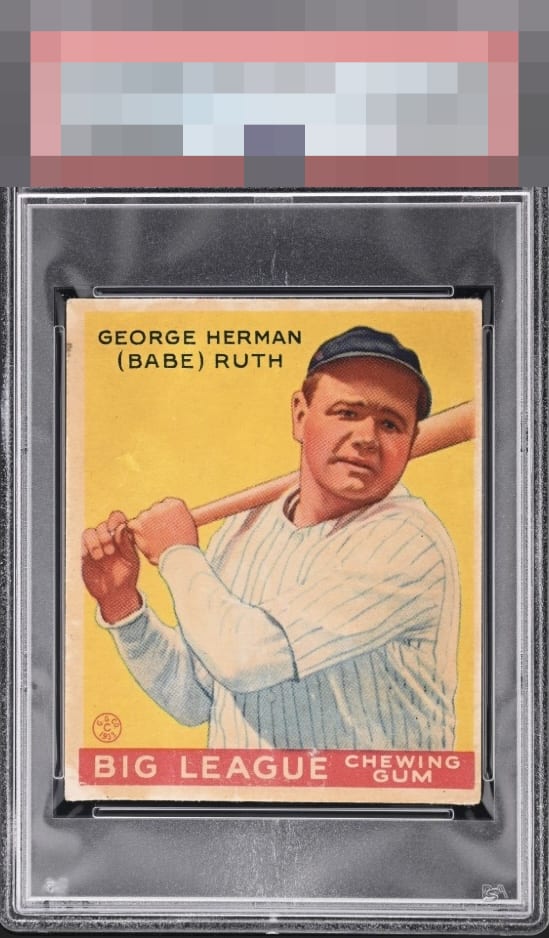
1934 World Wide Gum Babe Ruth #28

Reviews & Discussions
11 total reviews

The gorgeous color more than makes up for the poor centering and scattered surface damage. I'd be very happy to own this card.


The image looks great. Centering is the main issue. The border toning stands out more than usual because of the white spots in the lower left.

This is really easy on the eye and the stain or whatever it is on the lower left area does not scream out for attention. The mark along the top left border nags a teeny bit but the centering is what for me prevents an A- on what is overall a damn nice example.

Great looking card. I would say this example has eye appeal where it counts. The main attraction, when staring at Babe and the yellow, holds the eye super well. A longer look and you do see some flaws, but nothing major.

The centering and inconsistent border size is the first thing that caught my eye. The staining is there but doesn’t impact eye appeal for me.

The colors and image are good Do not like the size of the borders, them being off centered and that one spot on top left border

Very clean yellow. Centering is the only aspect to cite that affects my eye.

Colors are ok but seem to be a bit washed out. There's also some staining around the card. Still a very nice image of Ruth.
EyeQ+
EYEQ+ TROPHY CASE


Rating Distribution
11 total reviews
Strong eye appeal despite centering and wear to left edge at top and lower left. Those flaws do not wreck the party.