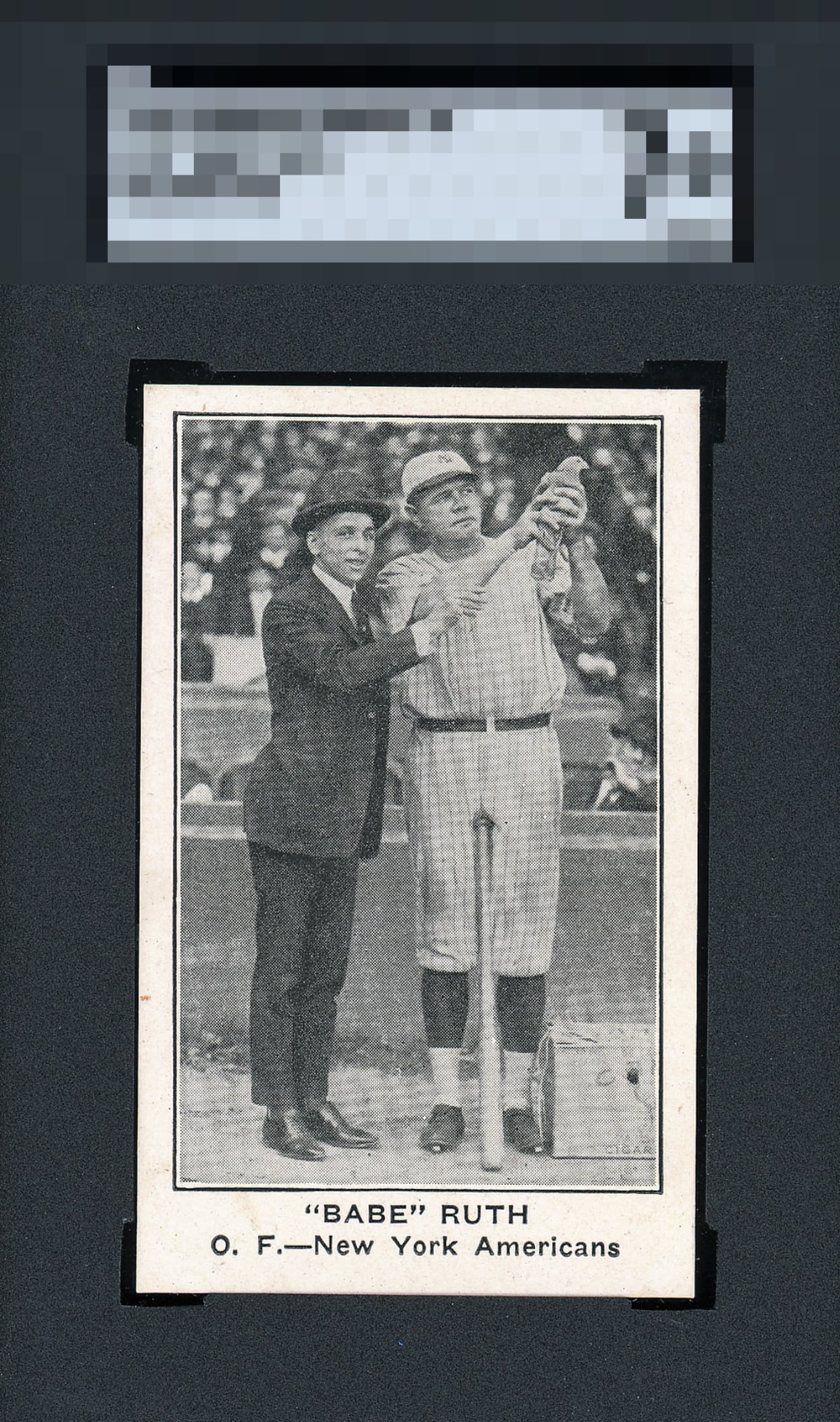
1922 E121 American Caramel Babe Ruth

Reviews & Discussions
10 total reviews

I could try and nitpick some detail here but that's not really the exercise. No eye appeal beefs to make with this card!


Great card, image is nice and the borders look clean and bright. Slight tilt and a couple stray marks are minor issues. I don't remember seeing a nicer example of this card.

The image looks beautiful and crisp to me. The centering appears slightly off, and I notice what looks like a small blemish on the white border, which for me keeps it just shy of the top tier.


This card radiates beauty from the moment you look at it. Despite a faint centering imbalance, the overall presentation is striking—vivid, balanced, and undeniably clean. The minor marks along the left border are inconsequential when measured against the visual harmony of the image. Every element works together effortlessly, and the card’s presence demands attention. From a collector’s standpoint, this sits firmly in the God Tier of eye appeal. Proof that perfection doesn’t need to exist.

Great looking card and love how clean and bright the card is and how sharp the images are. The borders are big and bold with the top slant sizing only opportunity As a RUTH Collector I would proudly add this to my collection

Very attractive looking card. Slight centering shift to the left and a small spot on the left border are the minor nitpicks. Beautiful!

Really a treat to stare at this a moment. I can get to God Tier with this centering. I notice the tiny border dot. But this is an A+ for beauty.

EyeQ+
EYEQ+ TROPHY CASE


Rating Distribution
10 total reviews
Only real distraction is that spot on the left border.