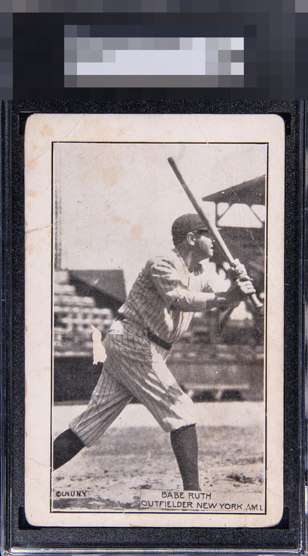
1920 Underwood And Underwood Babe Ruth

Reviews & Discussions
11 total reviews

Great image, centering and paper loss in a rather humorous place detract a bit from eye appeal. With better centering or no paper loss it hits the B's easily.

Love the image and contrast, so many of these super-old cards have image issues. The stands in the background and stadium detail are also a treat. The paper loss is an obvious eye appeal issue, but thankfully it avoids The Babe Himself! Centering would come next for improvement, then corners.

Creases and paper loss are hard to overcome. There's a great image here that's being dragged down by the aforementioned issues.

The image has held up nicely, which is the most important part on cards like this for me.

Find another one. Good luck. Sure it has a bit of dirt & writing on the back but doesn’t even bother me on this issue. Cards like this should be graded on a curve.

I must admit I did not even catch the spot of paper loss at first look! The Babe image held all my attention for a moment. Certainly there are issues from its journey through time yet the way the main image commands the eye is worth shouting out here.
EyeQ+
EYEQ+ TROPHY CASE


Rating Distribution
11 total reviews
Nice image of the Babe but there are quite a few surface issues, including the paper loss. Centering is also off and there's some corner wear.