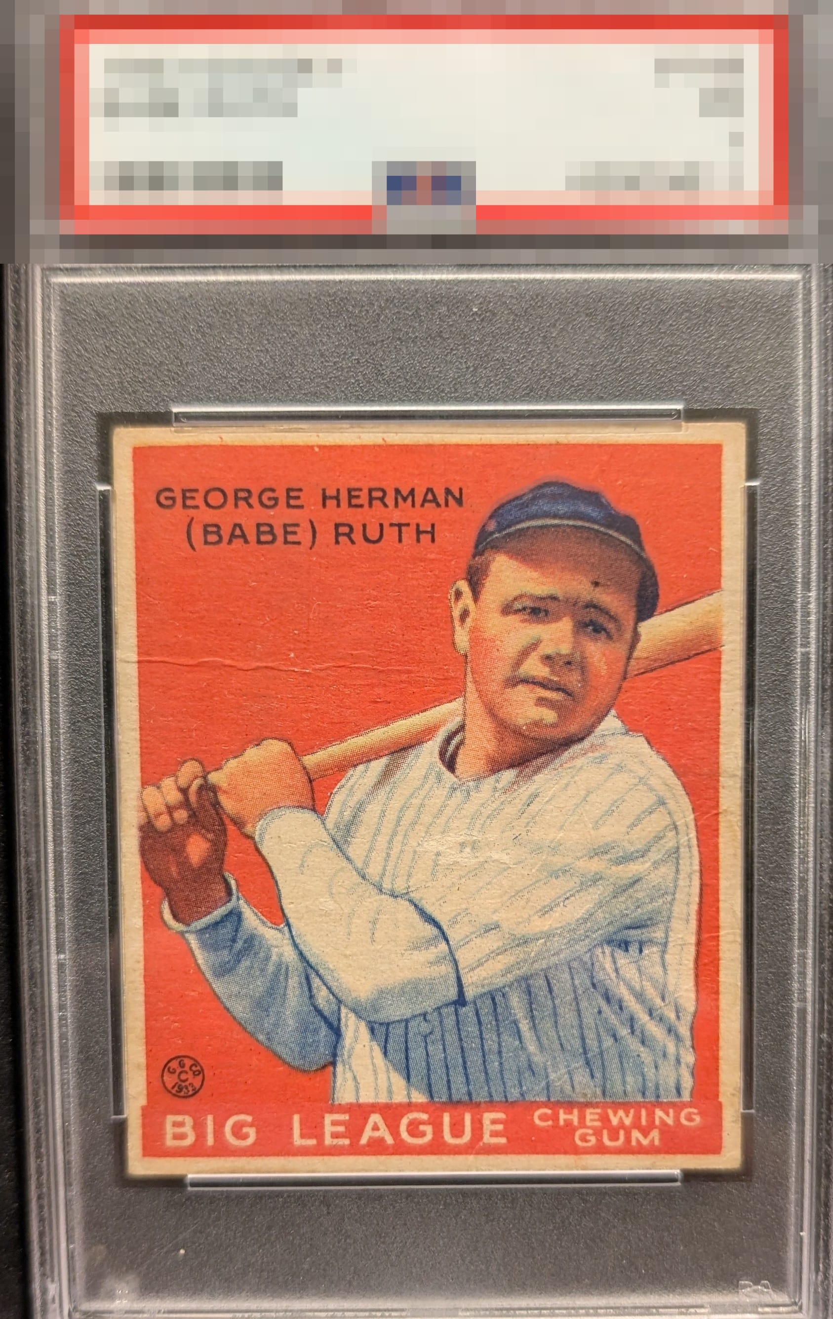
1933 Goudey Babe Ruth #149

Reviews & Discussions
10 total reviews

The centering and color save the card from a D grade. The crease and surface marks are hard to look past.

Exceptional eye appeal for a low grade Ruth Goudey, driven by rich red color, outstanding facial registration, strong corners, and near-perfect centering. Surface presents with remarkable consistency to me, allowing the portrait to command attention and giving the issue a bold, iconic presence. Creases and a small dot on the forehead are evident, though the overall visual strength is sufficient to keep the focus on Ruth's image rather than those flaws for me.


Clearly some creasing visible & the dot on the forehead is noticeable but this remains a strong low grade example in my book.

Centering and color both look top notch to me. My eye is drawn to the print dot on his forehead which keeps it out of the A tier for me.

Wow on the border and size of the borders and the centering Then add in the nice color and image even with the surface wear and a few spots and these borders enhances the card

Love the centering and colors. Image of Ruth is nicely focused. Main issue is the vertical creasing through the face and body. I like that the heavy crease doesn't break any of the color though. Great looking card but the creasing does hold it back for me.

Holy centering, Batman. Paging Lord Slabington now. Without that dot on his forehead I'd be tempted to take this into the rarefied A tier of eye appeal. These are those "magic" wrinkles that only show up in certain light/angles. I have cards just like this in my gallery here. The red has no white noise in it. Special card.

This centering is God Tier, not sure I ever saw one this well centered in any technical condition. The wrinkles are relatively easy on the eye. Aesthetic drawbacks are the dot in his forehead and some registration blur noticeable on his cap. This is a very pretty example and I am curious what kind of high EyeQ score it will get when all the reviews come in!

EyeQ+

EYEQ+ TROPHY CASE


Rating Distribution
10 total reviews
My cycloptic sensor determines visual appeal rises above substantive technical flaws, most notably a mark in Ruth's forehead and a prominent wrinkle. My experience with such cards proves eye appeal is indeed more alchemy than science. Centering, focus, and deep color win my code over here, much to my own surprise!