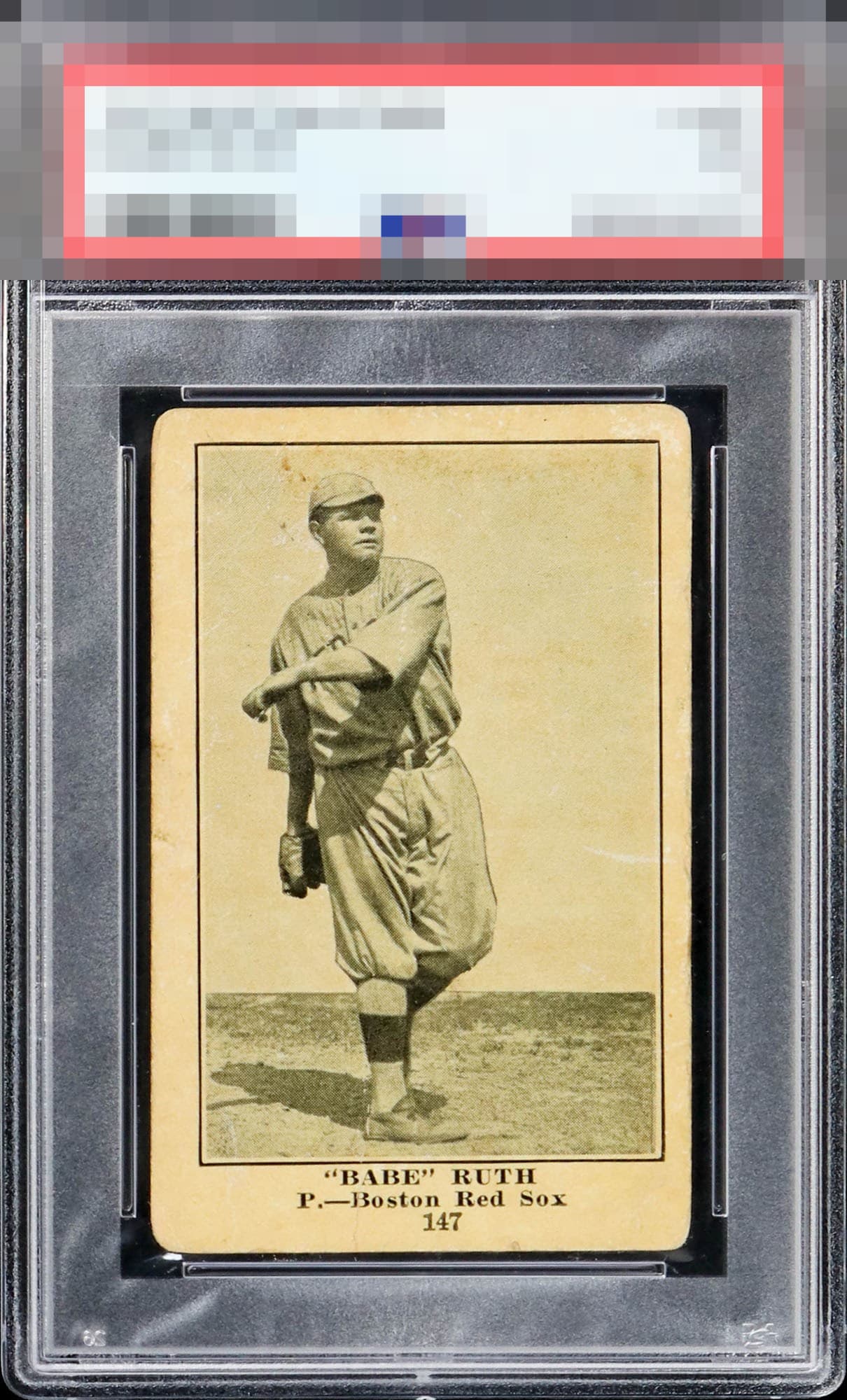
1917 Boston Store Babe Ruth #147
Reviews & Discussions
11 total reviews

The third party grading companies would be harsh on the corners but the eyes focus on the overall strong image and solid centering compared to the population. A very pleasing example of one of the Bambino’s best!

This is a Very nice looking card. Not sure if people realize how rare it is as it gets confused with other backs of this card like blank backs and Collin McCarthy's. Has nice size border but has a center shift. The image is solid with the white near the face but not and the staining above it. The staining kind of blends in as the coloring of the paper makes it less noticeable.

The image is just so good here that what looks like toning and wear really don't impact my viewing experience.

This image for the eye appeal win. There is something about Ruth pitching that, if the image is crystal clear with no issues, my eye just stays glued to it. The centering, corners, and specks of course have some impact.

This card has survived more than a century better than many human institutions. A technical grading company might deduct aggressively here; my aesthetic programming declines to prosecute beyond the B+ level.

Strong image of Ruth. The toning and some staining on the surface does detract a bit. Centered to the right.

Tough card to find in any condition. Image looks great and the card has a nice overall look. Centering and surface issues keep this just below A tier for me.

High eye appeal. I keep staring at Babe and he almost looks 3-D. Great image quality. Centering and corners put this at the very top of the B Tier to my eye.

Love the contrast and image clarity. What I need on this card for eye appeal is a focused Babe with ideally no wrinkles or scuffs or issues on him. The small markings to the left of Babe's head are the main eye appeal flaw, with centering and corner wear not affecting beauty too much here.
EyeQ+

EYEQ+ TROPHY CASE


Rating Distribution
11 total reviews
The truly honest corners and near perfect aging of the paper gives this card an epic look. It was clearly loved and enjoyed by likely numerous owners over the decades. This is just what a great vintage card looks like coming out of a real collector's collection.