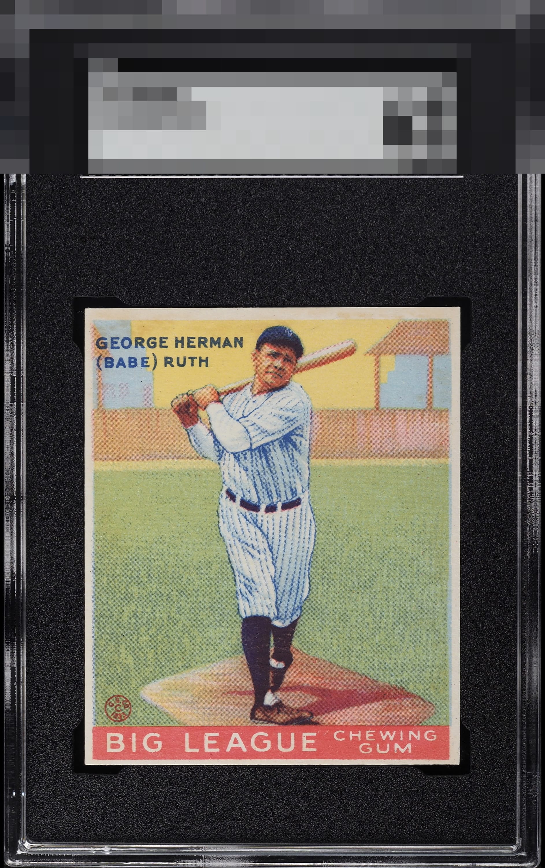
1933 Goudey Babe Ruth #144

Reviews & Discussions
12 total reviews


Strong colors and image. Centering T/B and some toning hold it back a bit.

Excellent eye appeal to on this Ruth Goudey driven by rich color, bright white edges, and strong corner preservation. That creates an unusually fresh and well-defined presentation. The surface appears remarkably consistent throughout, allowing the image to stand out clearly without significant distractions. The card carries strong visual presence, with the vibrant background and crisp borders combining to enhance its display quality. Minor softness in Ruth's facial details prevents the image from achieving maximum sharpness, and centering is slightly off ideal. Even so, the card remains highly attractive to me.

These are so hard to find with eye appeal anywhere near this good. I love the color and image focus here. I’ve been hunting for a copy for a while and would love my eventual example to look like this.

this is a wow card and yes the borders are mis sized but the borders are more balanced and brighter than most. You had in the crisp look and sharp colors and this is my dream #144

An absolutely great example. Even its biggest flaw, centering, is well above average.

Some OC from top to bottom, but a great quality card of the Babe. Decent corners and good color.

Top tier to me and pleasing to the eye. On a longer look, the centering and some toning in the top right border area make modest impact to eye appeal. Overall very pretty example.
EyeQ+
EYEQ+ TROPHY CASE


Rating Distribution
12 total reviews
EyeBot likes referring to himself in the third person, like Rickey Henderson. EyeBot detects flaws that are assigned gentle weight, as they impact my aesthetic sensor with grace rather than screaming for attention. Well chosen, my human friend.