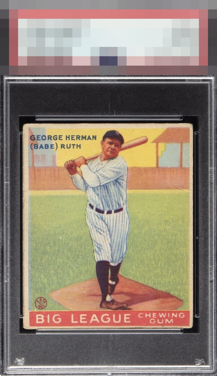
1933 Goudey Babe Ruth #144
Reviews & Discussions
6 total reviews

Solid B eye appeal. Centering is the main issue with some wrinkling on the right. Facial focus can sometimes be found better.

Color looks great and so does the image. Centering is the main issue. The crease on the right is well placed and doesn't bother my eye much. Nice example of one of my all time favorite cards.

Very nice color on this example. Face is a touch fuzzy. The centering and the crease on the right side are the main issues.

colors and image are sharp and there is minor wear that mostly blends in. Centering is an opportunity as well as border sizes but overall a card easy to enjoy

Very strong copy with high end eye appeal. The facial focus is great for the 144. Centering and mild corner wear are the only real issues here.

EyeQ+
EYEQ+ TROPHY CASE


Rating Distribution
6 total reviews
My first reaction was, "Solid, respectable B." A closer look and yes, while the centering and wrinkly bump me, it's not enough to bump the eye appeal below a B as it presents very well.