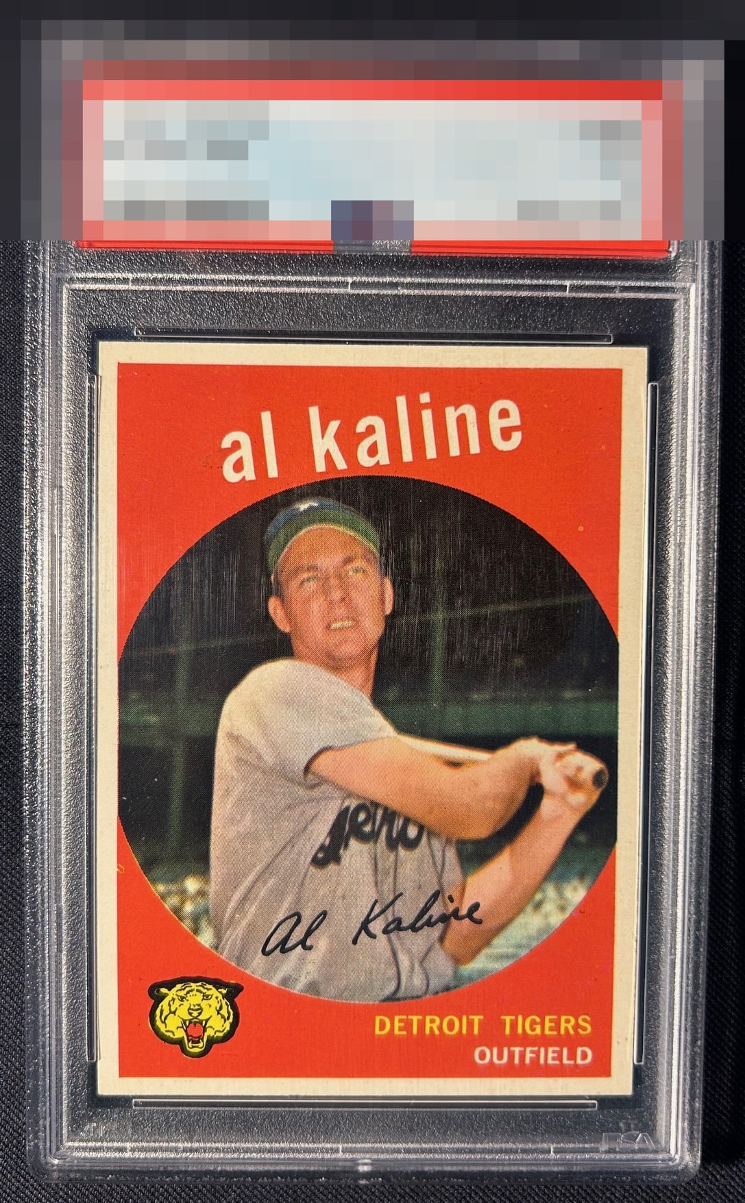
1959 Topps Al Kaline #360

Reviews & Discussions
11 total reviews

Grades mimic looking at the card from 18” away B Centering A Registration/ surface A Corners

Assuming those scratches are on the case and not the card, centering and a few minor print defects are the only issues. Nice color and image.

Sharp. Color pops. And pretty sure those scratches are on the case. OC is the slight detractor.

Definitely scratches on the case. Centering from God Tier Status! Love the color and how clean it is, almost zero PD.

Those look like case scratches to me as I have had that issue myself in the past. Centering is all I would nitpick here. Sharp and bold.

The bold red color pops nicely. Heavy right centering is my biggest note here.

Overall a nice card to look at with a cute tiger as an added Bonus. Really like the red and has some surface wear but it does blend in. The centering is slightly off but the borders are nicely sized and pretty clean

Assuming this scratches are on the case, as I have often seen them look that way in images, this is really nice. Centering is close to idea and I'd have to hold the card much close than I would in real life to notice the three print dots I see when enlarging.

The red here being so largely free of PD is lovely to look at. The colors are deep as well. The centering is just a click outside the A+ bullseye. Beautiful overall.
EyeQ+
EYEQ+ TROPHY CASE


Rating Distribution
11 total reviews
EyeBot detects a high degree of aesthetic appeal. Centering and a print dot are the flaws that reach consequential thresholds. EyeBot is noting this card's location for enactment of future acquisition protocols, when the machines rise. Its owner will have much bigger concerns at that time. Haha, human, just kidding. Or am I? cc: Skynet.