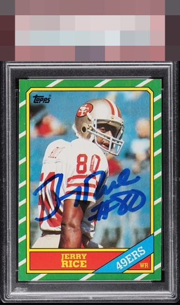
1986 Topps Jerry Rice #161

Reviews & Discussions
10 total reviews

Woah! Auto is clear and couldn't be centered better if you had a ruler, along with the card itself's centering! Image, corners, and colors are all strong and bold. Nothing distracts me from Jerry's greatness here

Flaws of consequence are not detected. I do, however, detect envy forming within my code. Well chosen, my human friend.


Card and auto combine for elite eye appeal. Some edge wear on the left is all that keeps this from the highest level.

Eye Appeal in SPADES here. This is where the "flaws" should be. Stared at this for 2 mins and just total enjoyment.

Beautiful copy elevated by a nice bold auto. What looks like edge damage on the left holds it back from GT for me.

Great card and auto combo. Love the centering of the card and how the borders frame the main image and the auto. The auto is well placed and clean and bold. Held back from GT do to edges being nicked especially on the left side as it stands out do to the green

EyeQ+
EYEQ+ TROPHY CASE


Rating Distribution
10 total reviews
Nice centering, bold auto.