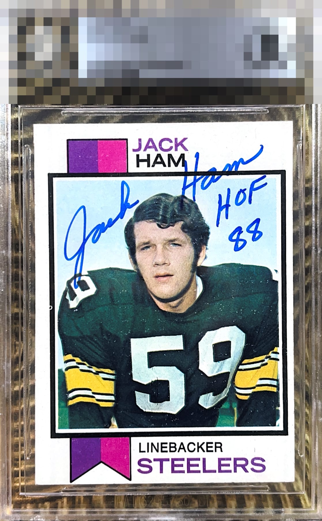
1973 Topps Jack Ham #115
1 / 2

💬
Reviews & Discussions
5 total reviews

To me the centering and the speckling hold the card down. while the autograph elevates the card. The placement of autographs on this card is tricky and he nailed it the way he signed it and it is clean and legible and it does stand out. The card left/right shift hurts the framing of the card and the surface wear/snow is bothersome but only if you look close. But that auto carries the day

Love the bold blue auto and inscription. The L/R centering and snow on the jersey are the main issues that draw my eye. Presents well.
3 reviews
2 reviews
EyeQ+
--
Not eligible for AUTH cards
Global Population
1
POPULATION ACROSS ALL GRADES AND GRADING COMPANIES
Global Eye Rank
—
Not eligible for AUTH cards
Population in Grade
1
POPULATION IN THIS GRADE ACROSS ALL GRADING COMPANIES
Eye Rank in Grade
—
Not eligible for AUTH cards
EYEQ+ TROPHY CASE

GLOBAL

IN-GRADE
EyeQ+ scores are not available for AUTH cards.
📊
Rating Distribution
5 total reviews
G
0%
A+
0%
A
0%
A-
2 ratings
67%
2
B+
0%
B
1 rating
33%
1
B-
0%
C+
0%
C
0%
C-
0%
D+
0%
D
0%
D-
0%
F
0%
Centering shift keeps it in the 2nd tier but nice