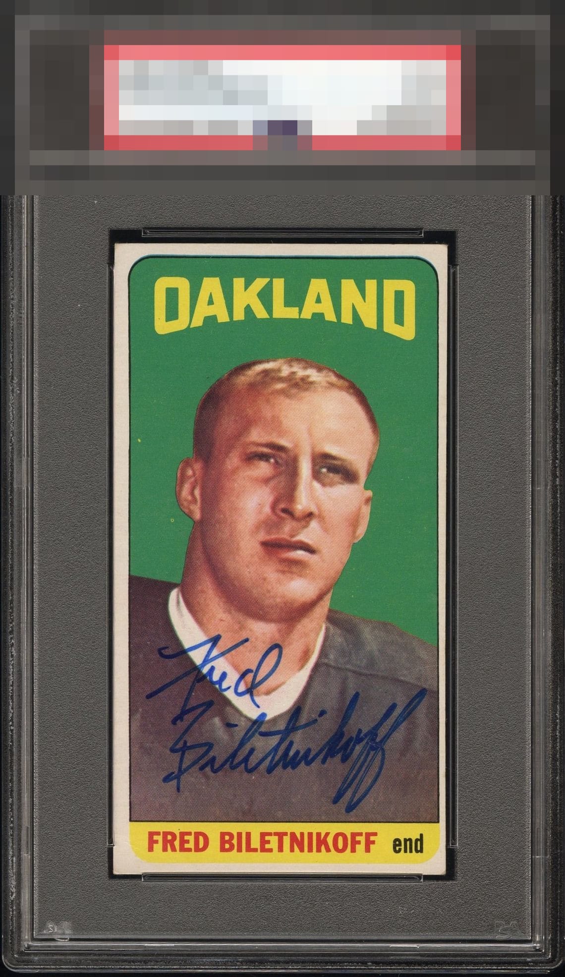
1965 Topps Fred Biletnikoff #133

Reviews & Discussions
10 total reviews

For signed vintage this is A level eye appeal all the way. Great auto.


Signature is bold, well placed, and easy to read. The card is in nice shape as well and the color looks great. Very nice looking card. Centering is the only issue for me.

I love this card. The colors. The autograph. The image. Just beautiful.

The only thing my eye notices that takes the eye appeal down is the side centering. Easily an A-, top tier eye appeal. Great sig where it has gotta be.

Two white spots to the left catch my eye and the borders are both mis-sized and off center and it is to noticeable to ignore. The Colors are nice and the Image is nicer. The Autograph is well placed and nicely signed and nice and bold. Like this card alot.

Great overall eye appeal. The autograph is in the right spot and commands attention, stylishly executed. It all comes together very well here. Centering matters much less so to me on signed vintage. The colors pop, and only two specks in the green that barely distract.

Love the colors and image. Beautiful signature as well. Only minor nitpicks are the L/R centering and a couple print spots. Great looking card.
EyeQ+
EYEQ+ TROPHY CASE


Rating Distribution
10 total reviews
Signature really adds to this one. Very nice.