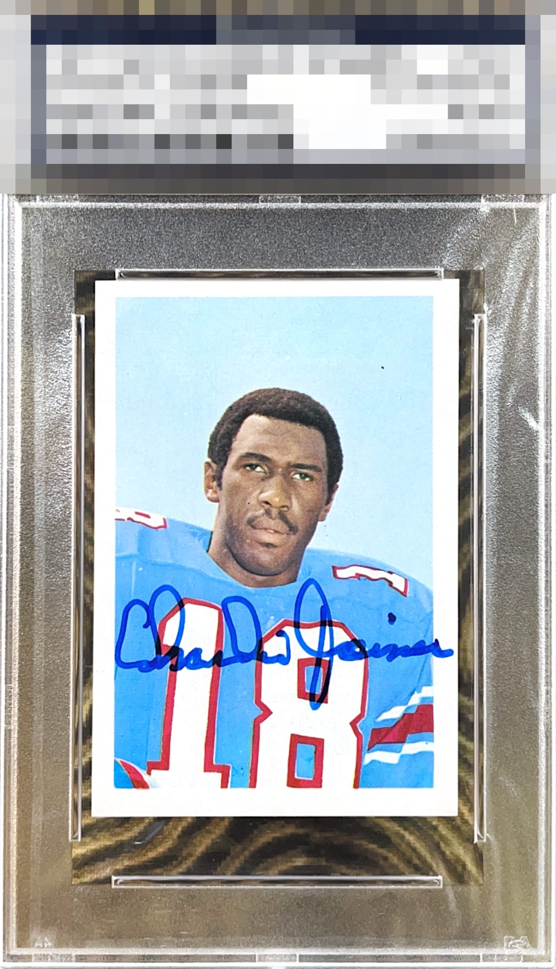
1971 Team Issue Charlie Joiner #161

Reviews & Discussions
10 total reviews

Background color is sensational. Auto is a bit disjointed as Charlie was likely doing his best to keep the full name on the card. I love this example.

A Beautiful bold well placed blue auto of the tones of blue in the sky and Charlie’s jersey - all works well together in way that’s eye pleasing. Centering the main opportunity here.

This is one sweet signed vintage piece. The auto jumps out at the eye in a great way and the centering is not a problem for me on these.


I love the bold auto, which pops and adds to the presentation. Centering is my main note here.

The auto is bold and well placed. The card is clean with bright color and borders, but the centering is off and that stray dot in the upper right stands out.


This overall a nice looking card/autograph combo. The auto is nicely located, nice and bold but not his best auto. The card is clean and bright and nice colors and image but the off centering holds it back as well as 1 spot very noticeable to me up and right of his head. But overall a great card to have

Centering is the main issue. Colors and image are on point with a nice bold auto.

EyeQ+
EYEQ+ TROPHY CASE


Rating Distribution
10 total reviews
Great eye appeal. The auto pops, no flaws but centering which makes less impact to my eyes on a vintage signed piece.