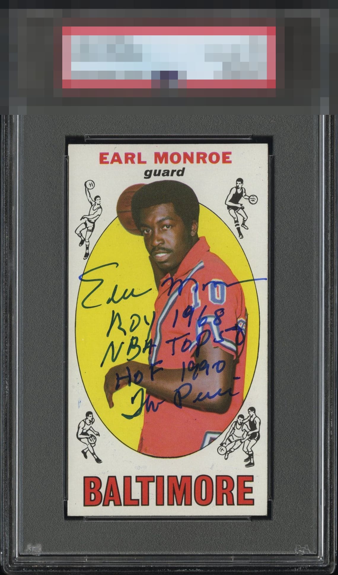
1969 Topps Earl Monroe #80
1 / 2

💬
Reviews & Discussions
5 total reviews


Well-centered and the auto and inscription look very bold and free of any streakiness. Great looking card.

nice looking card and nice clean autograph. To me it is to much writing with the auto as it blocks to much of the image and much of the writing blends in

For signed vintage this is eye candy. The inscriptions work here; too often they crowd a card. Centering is great for a signed copy and no loud flaws that distract my eye. Fan of this piece.
5 reviews

0 reviews
EyeQ+
--
Global Population
1
POPULATION ACROSS ALL GRADES AND GRADING COMPANIES
Global Eye Rank
—
No Eye Q+ score
Population in Grade
1
POPULATION IN THIS GRADE ACROSS ALL GRADING COMPANIES
Eye Rank in Grade
—
No Eye Q+ score
EYEQ+ TROPHY CASE

GLOBAL

IN-GRADE
Trophies appear here when earned.
📊
Rating Distribution
5 total reviews
G
2 ratings
40%
2
A+
2 ratings
40%
2
A
0%
A-
0%
B+
1 rating
20%
1
B
0%
B-
0%
C+
0%
C
0%
C-
0%
D+
0%
D
0%
D-
0%
F
0%
Rarely do I see inscriptions work this well. Normally they look too busy, but this Pearl makes it work. Centering, corners, edges, everything is tight.