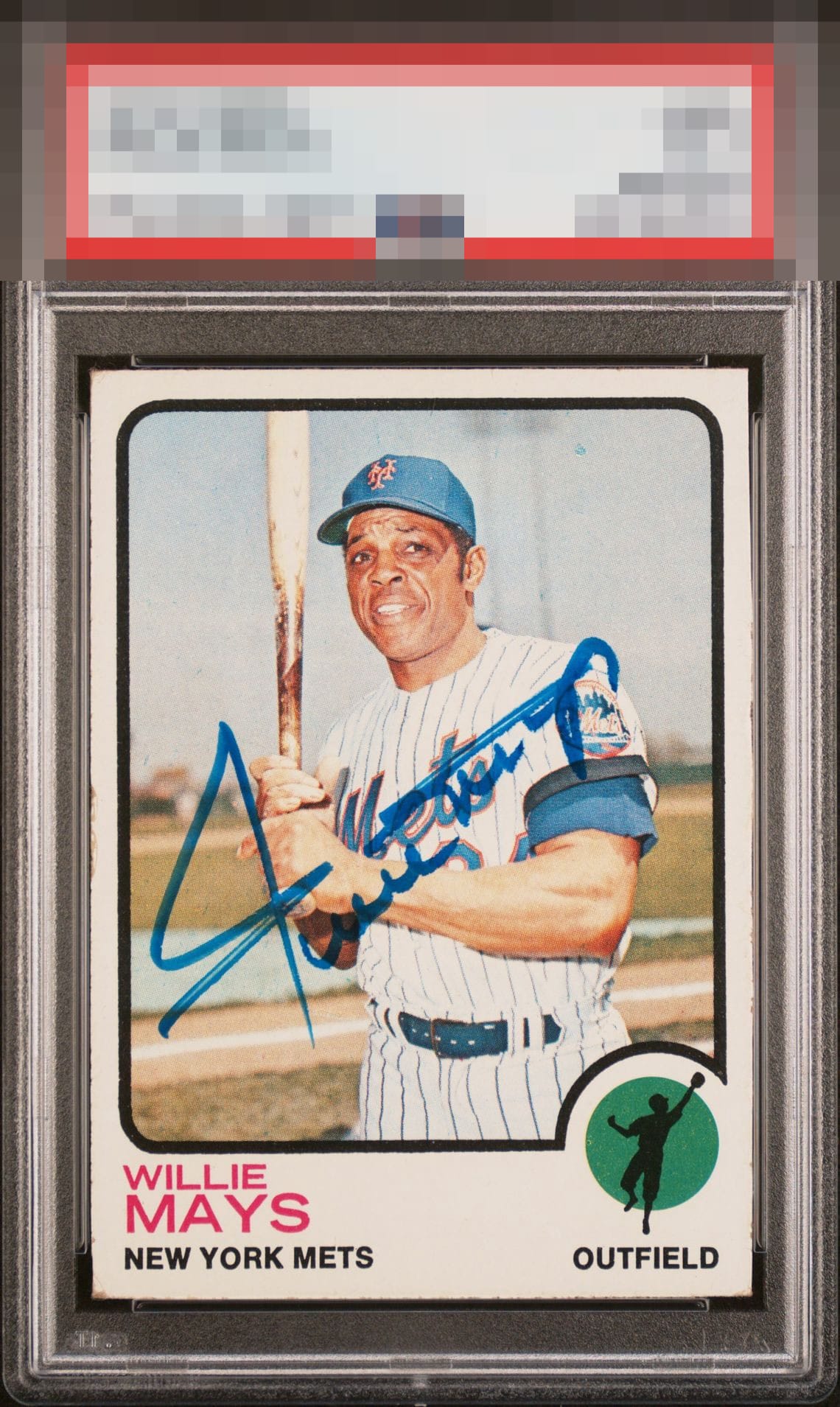
1973 Topps Willie Mays #305

Reviews & Discussions
10 total reviews

Centering is strong along with colors, and just a corner touch brings down the grade. Clean auto as well.

Nice Mays auto and card! The auto reads clear, is not distracting to Mays' face, and the blue shows well. Card itself is appealing aside from some noticeable edge wear and lower left corner. Hard to find the card as well centered as this one!

Very attractive, color match sig with just a little bit of streak

Hits well overall, despite some wear and streakiness. The centering and auto size and placement win me over.

Nice looking copy with above average centering, crisp image, and nice color. The streaks in the auto distract my eye a bit.

This comes together. A great example of flaws existing, but they don't get in the way of top tier Eye Appeal. The centering and absence of PD for a '73 are noteworthy. My main issue is the faintness of his horizontal strokes in the auto, but that's all that keeps this from an A or higher for me. Great card.

Very well-centered but has some edge wear. Auto is a little streaky but the overall look of the card I like.

Pleases the eye, everything comes together very well. Centered card and a signature in the right spot. Mild streakiness to the initial pen stroke is my only critique; the corner wear is totally fine to me on signed vintage, which is its own thing. I like how it is treated as such on this site.

nice card and better autograph and combined makes something special. The card is nice and bright and borders are well sized and centered. The borders have condition issues But The autograph is well placed and nice and bold and legible and doing it on the angle works really well

EyeQ+
EYEQ+ TROPHY CASE


Rating Distribution
10 total reviews
Great looking card and it's hard to find a signed vintage card centered this well. Auto is well placed but is a little faded or streaky in a couple spots. Some minor corner and edge wear doesn't impact the overall appeal much at all.