1948 Leaf Warren Spahn #32

Reviews & Discussions
11 total reviews

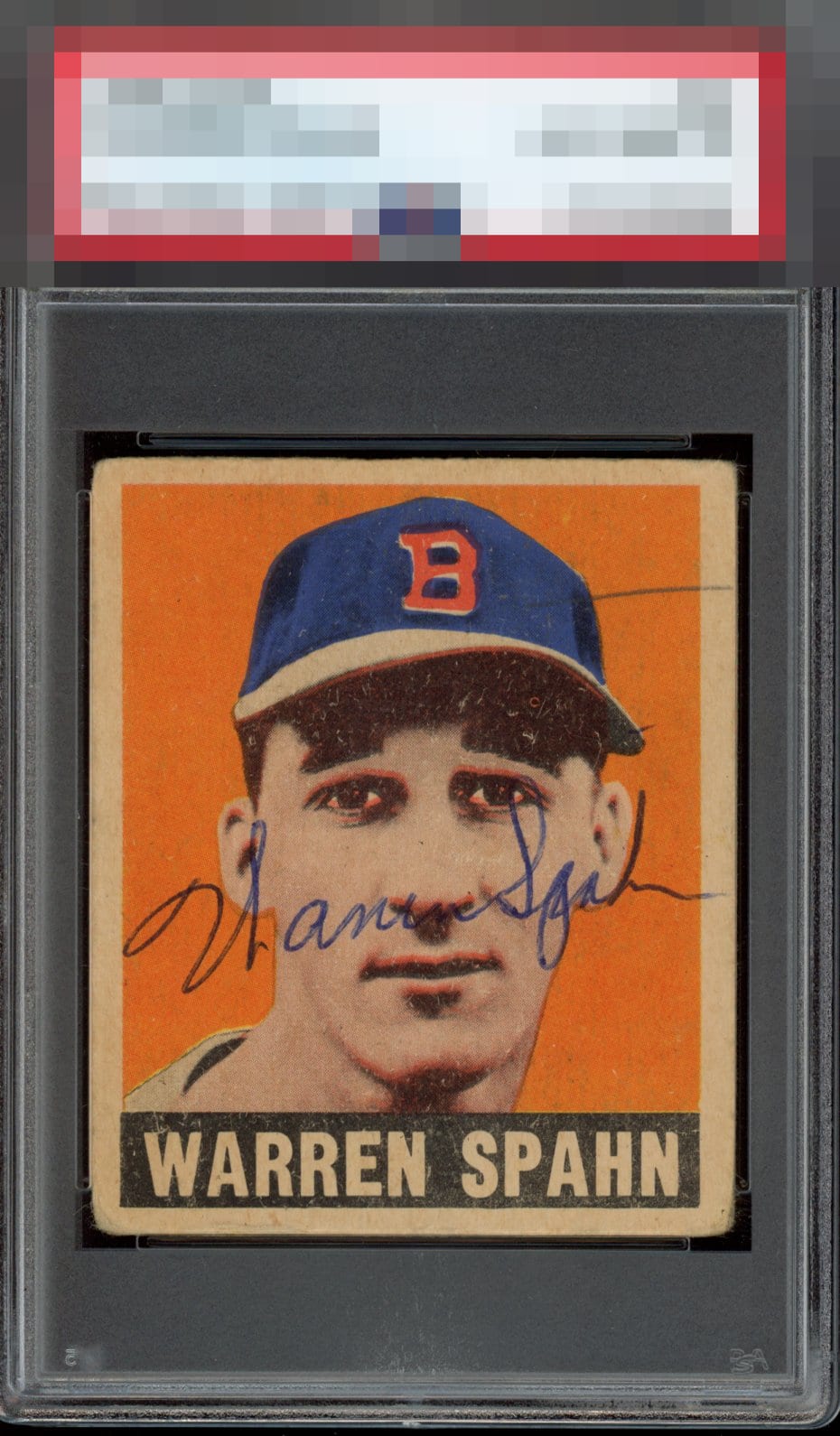
Wish he signed this lower. The registration is great and so is the auto but this shows how crucial auto placement is to eye appeal.

Great ballpoint sig, just wish it was a bit lower. Extra mark at the top isn’t ideal, but the centering of the card itself is.


Wish the auto wasn't across the face. A lot of surface issues and a fisheye under the cap. A random horizontal pen mark on the upper right detracts as well.

The signature placement takes away the beauty of the card. I also don't like the pen mark by his hat. This card is beautifully centered, I'd rather have this version non autographed than this autographed version.

The centering and color look great, especially for a signed card. But that's a pretty big stray pen mark. Also it would have been nice to see the signature below his mouth not above.

Love the auto but the placement makes the auto look like a moustache and the pen line to the right of the hat distracts me.

A Color C Registration / Surface A Cut / Centering B- Autograph Auto placement

Great centering for a signed vintage card, and pen is always preferred-- the placement is the lone eye appeal issue, for my taste, here.
EyeQ+
EYEQ+ TROPHY CASE


Rating Distribution
11 total reviews
The location here is just rough on the eye is all. The card is actually very strong for signed vintage.