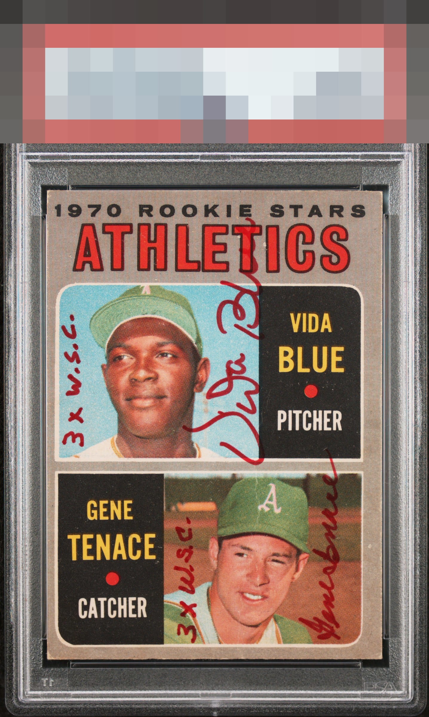
1970 O-pee-chee Vida Blue / Gene Tenace #21
1 / 2
Click to enlarge
💬
Reviews & Discussions
4 total reviews

the card is not the best especially the centering and the crease is in the worst place possible. Those auto's and inscriptions are well placed and legible

A bit off-centered. Crease through Gene's face. That being said, the autos look great.

The known corner wear and centering don't bother me much as I'm drawn to the visit colors and great autos and inscriptions

4 of 7 reviews

0 reviews
EyeQ+
--
Global Population
1
POPULATION ACROSS ALL GRADES AND GRADING COMPANIES
Global Eye Rank
—
No Eye Q+ score
Population in Grade
1
POPULATION IN THIS GRADE AND GRADING COMPANY
Eye Rank in Grade
—
No Eye Q+ score
EYEQ+ TROPHY CASE

GLOBAL

IN-GRADE
Trophies appear here when earned.
📊
Rating Distribution
4 total reviews
G
0%
A+
0%
A
1 rating
25%
1
A-
1 rating
25%
1
B+
2 ratings
50%
2
B
0%
B-
0%
C+
0%
C
0%
C-
0%
D+
0%
D
0%
D-
0%
F
0%
This piece really works for me. What charms me most is the symmetry in how they laid out their autos. No print flaws scream out at me from the black nameplates. Good centering.