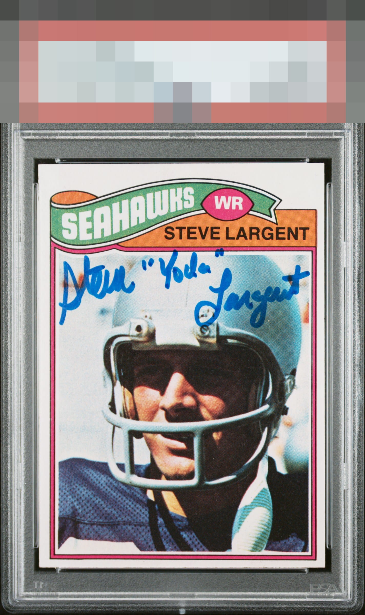
1977 Topps Steve Largent #177
1 / 2
Click to enlarge
💬
Reviews & Discussions
4 total reviews


My reviews are based on imagining the card is 12” to 18” away. That’s what eye appeal is to me. B Centering , corners & edges A Surface, Color & registration

The impact of centering on eye appeal is mitigated here, since it is autographed— and that auto is placed and struck beautifully. The other aspects of the "canvas" are top tier, save that centering.

4 of 7 reviews

0 reviews
EyeQ+
--
Global Population
1
POPULATION ACROSS ALL GRADES AND GRADING COMPANIES
Global Eye Rank
—
No Eye Q+ score
Population in Grade
1
POPULATION IN THIS GRADE ACROSS ALL GRADING COMPANIES
Eye Rank in Grade
—
No Eye Q+ score
EYEQ+ TROPHY CASE

GLOBAL

IN-GRADE
Trophies appear here when earned.
📊
Rating Distribution
4 total reviews
G
0%
A+
1 rating
25%
1
A
0%
A-
2 ratings
50%
2
B+
1 rating
25%
1
B
0%
B-
0%
C+
0%
C
0%
C-
0%
D+
0%
D
0%
D-
0%
F
0%
the card and auto need to work together to make the Eye Appeal Pop. The card is nice and clean and bright but the centering is off and does not frame it well. The auto is well placed and nice and bold. Overall works