1958 Topps Stan Musial #476

Reviews & Discussions
10 total reviews

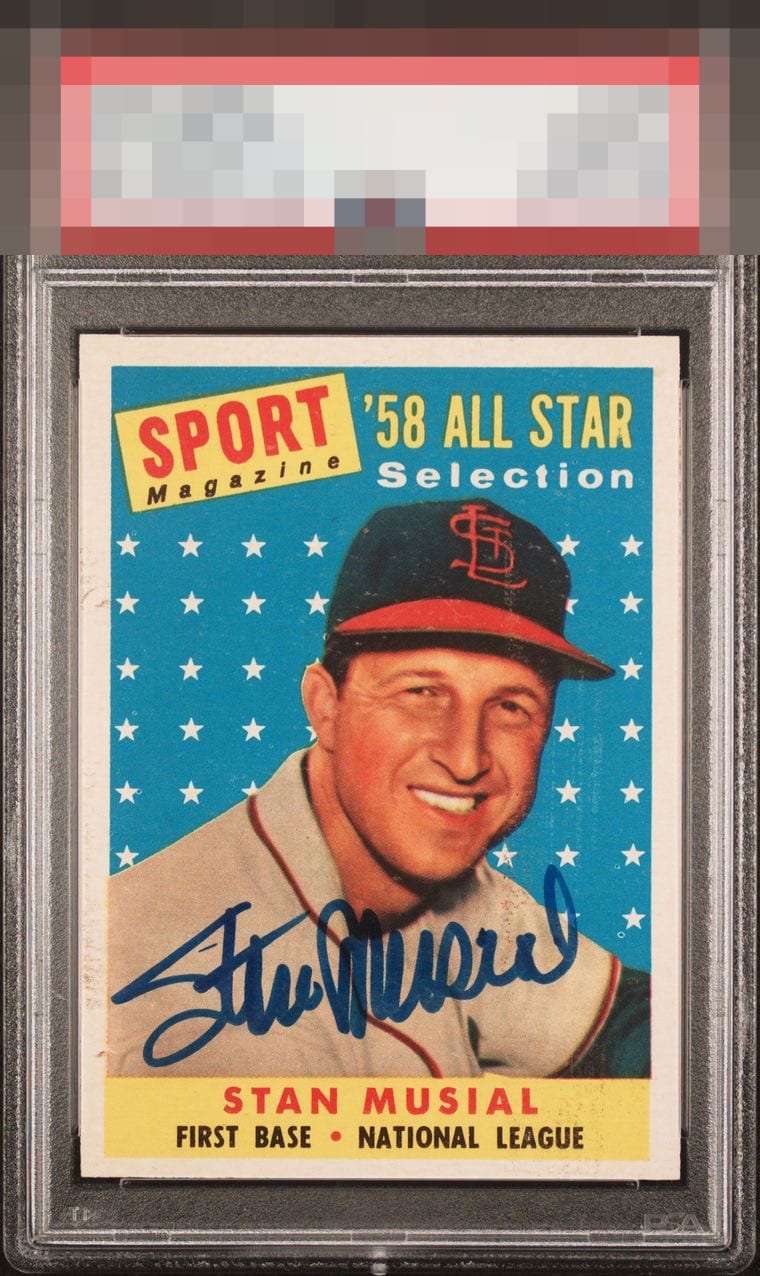
Beauty of a first Topps Musial. The auto is bold and practically musical. Card itself is sharper than cleats. Centering, tilt and surface issues, particularly down the middle of the hat, account for the minus.

Signed is very different to me in terms of eye appeal determination, versus unsigned. My eye is held to his face and autograph, then I see more than acceptable centering. The border damage and some print issues fall way to the back of the line here.

Great looking auto, bold and well placed. There are some surface issues around his face and the centering is off with some tilt. But because of that auto they wouldn't bother me as much.

On this card, I just find my eye does not lock onto the flaws as it would on an unsigned copy. These are different animals with the signature, and for me it's more the overall impression or reaction I get.

The autograph really pops against the blue backdrop. While the centering could be better, it’s good enough to keep my eye focused on the image. There’s a bit of snow around the face, most noticeable on the hat. Overall, this has nice eye appeal.

Great card. Up and down centering and discoloring on the borders bring down the eye appeal.

Good Looking card. THe colors POP and the clarity is really good. THe Autograph is nice and in a great location

Third party grade and visual appeal are out of sync on this piece. Perhaps that is a pin hole visible on the reverse? Whatever the cause for the third party opinion, this collector's eye is very pleased looking at this Stan The Man. The auto is great and the card is, too-- just some surface issues that grab the eye mildly, and do not distract too much from the overall presentation.
EyeQ+
EYEQ+ TROPHY CASE


Rating Distribution
10 total reviews
Centering is a bit low and some surface issues hold it back. It’s too attractive to fall into the B range for me.