1983 Topps Ryne Sandberg #83

Reviews & Discussions
10 total reviews

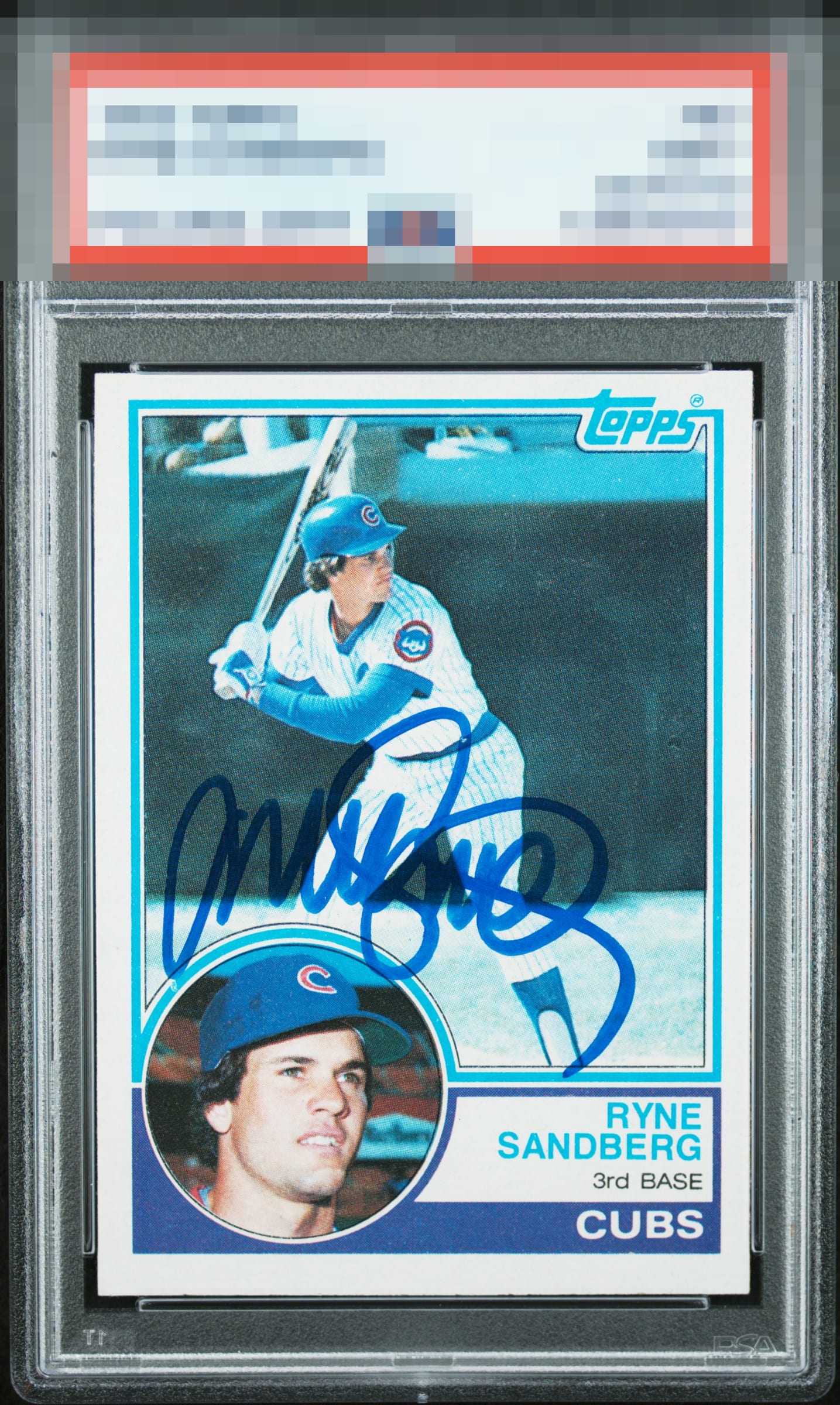
Auto is well placed and clear. Card itself has well balanced centering and good registration. The background shows some surface softening which detracts from the image

Love that Wild Style auto, no loud flaws save centering-- and I care much less about that on a signed vintage card.


The signature is beautiful, perfectly placed. The edges, corners, and colors are sharp. The centering is an issue and so is the registration which is off around the portrait insert. This is wonderful card regardless of the aforementioned issues.

Signature looks great, very bold. Centering is off both ways and there are minor surface issues. The card is very clean.

The card and the autograph enhance each other. The card has centering opportunities and minor surface wear if you look. But it is clean and bright and has a nice image The autograph is well placed and nice and bold and beautiful. Love this card

Centering is a bit high. Minor blemishes in the background but the image is good. Nice bold auto.
EyeQ+
EYEQ+ TROPHY CASE


Rating Distribution
10 total reviews
A beautiful Ryno rookie auto here. Love the auot placement over the his portrait. Everything works together nicely and presents as a very solid A level eye appeal in my book. Only centering and a bit of surface hold it back from GT.