1961 Topps Ron Santo #35
1 / 2
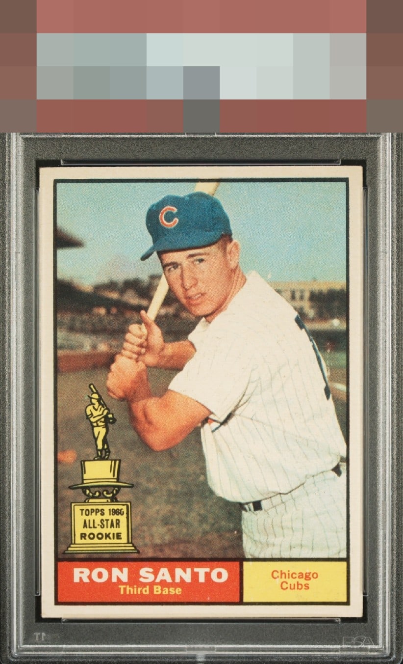
Click to enlarge

💬
Reviews & Discussions
7 total reviews


Only some slight surface specks detract for me. Incredible example.


This has "it" to my eye, love the centering. I am such a softee when it comes to the Rookie Cup logo! Love those cards. No distractions here bump my eye even on a longer viewing.

I like this copy a lot. The centering is right where I’d want it, and the image and color present really nicely.

Locked

0 reviews
EyeQ+
143.0
Global Population
1
POPULATION ACROSS ALL GRADES AND GRADING COMPANIES
Global Eye Rank
#1
Population in Grade
1
POPULATION IN THIS GRADE ACROSS ALL GRADING COMPANIES
Eye Rank in Grade
#1
EYEQ+ TROPHY CASE

1st Place
GLOBAL

1st Place
IN-GRADE
📊
Rating Distribution
7 total reviews
G
0%
A+
3 ratings
43%
3
A
2 ratings
29%
2
A-
2 ratings
29%
2
B+
0%
B
0%
B-
0%
C+
0%
C
0%
C-
0%
D+
0%
D
0%
D-
0%
F
0%
Beautiful card with minor PD the lone separator from GT status.