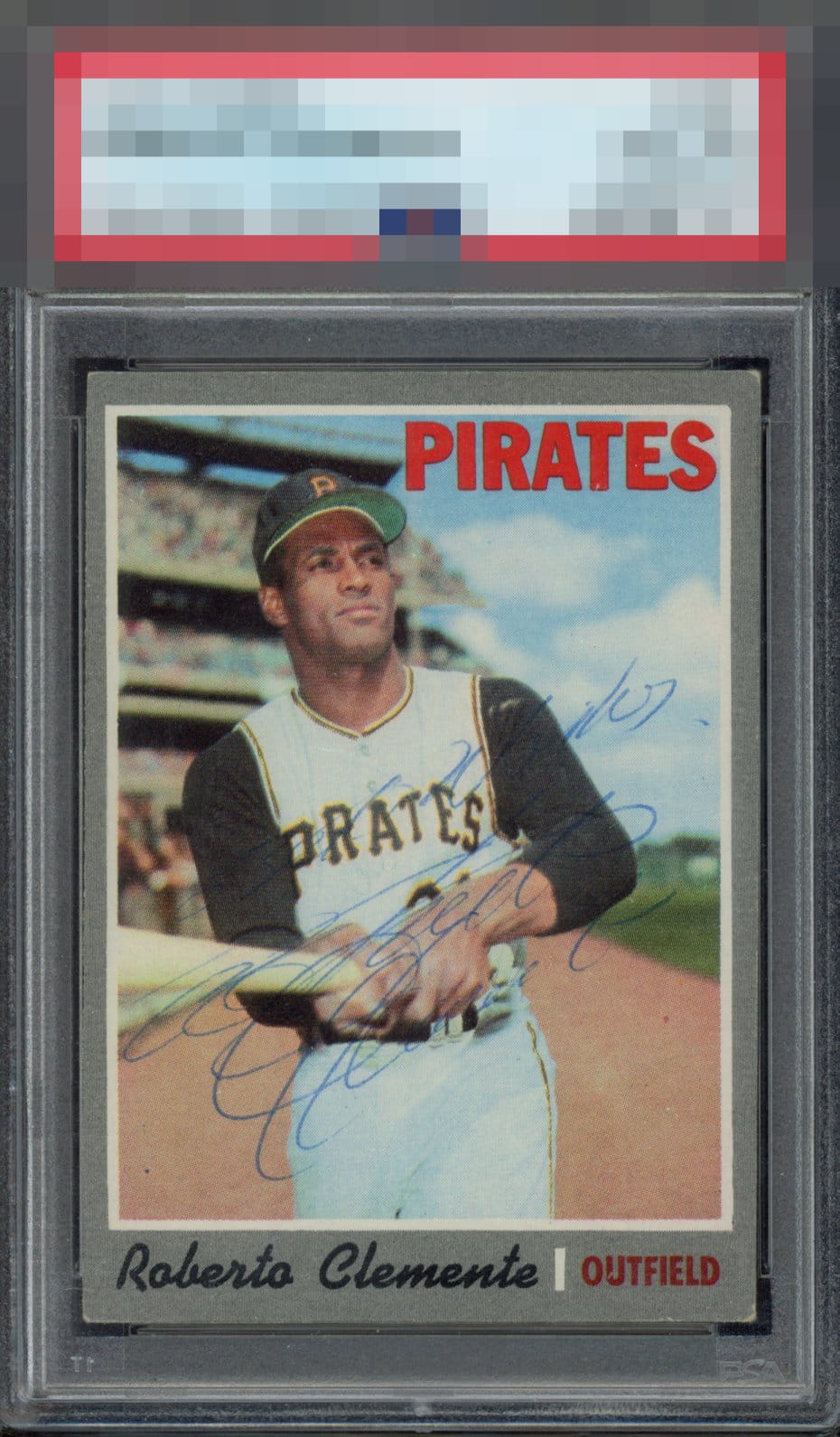
1970 Topps Roberto Clemente #350

Reviews & Discussions
10 total reviews

So hard to find any of his cards signed. The auto is a little hard to make out, but a ball point will never be as bold as a sharpie. Card could be centered a little better, but that wouldn't stop me from enjoying this card.

Color and registration are great. The card pops. Bit of a tilt. The fact that it's an auto'd 1970 itself is pretty great. The sig itself looks like a very quick take. Would prefer something more deliberate and clear. That being said, who has the luxury of a choice of Clemente sigs?

Overall eye appeal thanks to a nice card and stylish vintage ballpoint. Comes together nicely. Wish the sig were bolder but these pieces are so unique.

Very pretty piece. Clemente sure had interesting style in his auto!

Nice overall presentation and I’m into the auto. Just a cool card slightly held back by centering/tilt for me.

A = Color A = Registration / Surface C+ = Cut / Centering C = Autograph Tough Clemente card to find signed. This is one of his quick scribble signatures that unfortunately is hard to see on cards. Tilted left to right centering distracts from 18” away due to Topps chosen gray border color. Would not be obvious if the border black or Topps picked a different color than white for the inner border line.

This is not a card for me. I am sure others would like it. But the autograph looks like scribble on the card and it is not bold. With that said it is a Clemente Auto and those are limited so for an autograph person this is one

With signed cards, they just gotta have "it." This one does. Sometimes it's that simple. Pure gut reaction. Love it.
EyeQ+
EYEQ+ TROPHY CASE


Rating Distribution
10 total reviews
I like the look of this card, which is very well conditioned for signed vintage. I can never read his handwriting but the man had style, and it adorns this card nicely, creating a special item.