1955 Topps Roberto Clemente #164
1 / 2
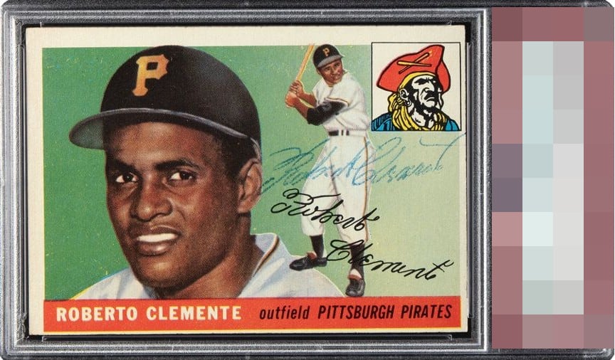
Click to enlarge
💬
Reviews & Discussions
3 total reviews

Good auto but a little on the light side. Image of Clemente looks strong. Heavily off-centered.

A great auto— and his auto on his RC is almost always problematic for some reason or other— is offset eye appeal-wise by an extreme centering shift. The overall look remains second tier to me thanks to that auto and a strong card except for the centering.

3 of 7 reviews

0 reviews
EyeQ+
--
Global Population
5
POPULATION ACROSS ALL GRADES AND GRADING COMPANIES
Global Eye Rank
—
No Eye Q+ score
Population in Grade
2
POPULATION IN THIS GRADE ACROSS ALL GRADING COMPANIES
Eye Rank in Grade
—
No Eye Q+ score
EYEQ+ TROPHY CASE

GLOBAL

IN-GRADE
Trophies appear here when earned.
📊
Rating Distribution
3 total reviews
G
0%
A+
0%
A
0%
A-
0%
B+
0%
B
2 ratings
67%
2
B-
1 rating
33%
1
C+
0%
C
0%
C-
0%
D+
0%
D
0%
D-
0%
F
0%
mid tier but enjoyable. Nice card with good image and colors but off center and some surface wear. Auto is well placed and legible but not bold and actually blends in a bit