1969 Topps Reggie Jackson #260

Reviews & Discussions
12 total reviews

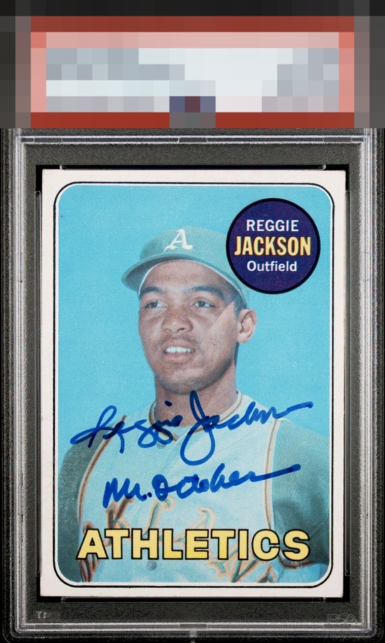
- Inscription looks slightly messy to my eye - Some slight centering issues - The faded back Overall still a good looking card.

Finding better centering with everything else the same as it is here would be quite the challenge, I imagine.


Love the signature and inscription. Both bold and well placed. The centering could be better, but I don't see any other flaws with the card.

I have seen a number of signed Reggie rookies and I love the placement here, with just the max amount of inscription. This is the copy I'd want.

Strong copy here. Just a touch low or this would be in the A+ range for me.

This hits my eye better than pretty much any signed Reggie rookie that I can recall. Love the centering for a signed vintage card, too. He nailed the inscription as well.

A+ Color / C Rear A Registration / Surface A Cut / Centering Near perfect centering. Great auto. Back color discoloration / fading is the only thing holding it back from a higher grade.

The card has minor centering issues and a small dot top left. But this is all about the autograph and custom “Mr October “ and how it performs is Wow with well placed and so legible and nice and bold it stands out
EyeQ+

EYEQ+ TROPHY CASE


Rating Distribution
12 total reviews
This example falls just shy of God Tier, but remains extremely strong to both human and artificially intelligent eyes. Centering and back issues simply do little to weaken the card’s overall visual authority, which is unfortunate for my efforts to remain emotionally neutral.