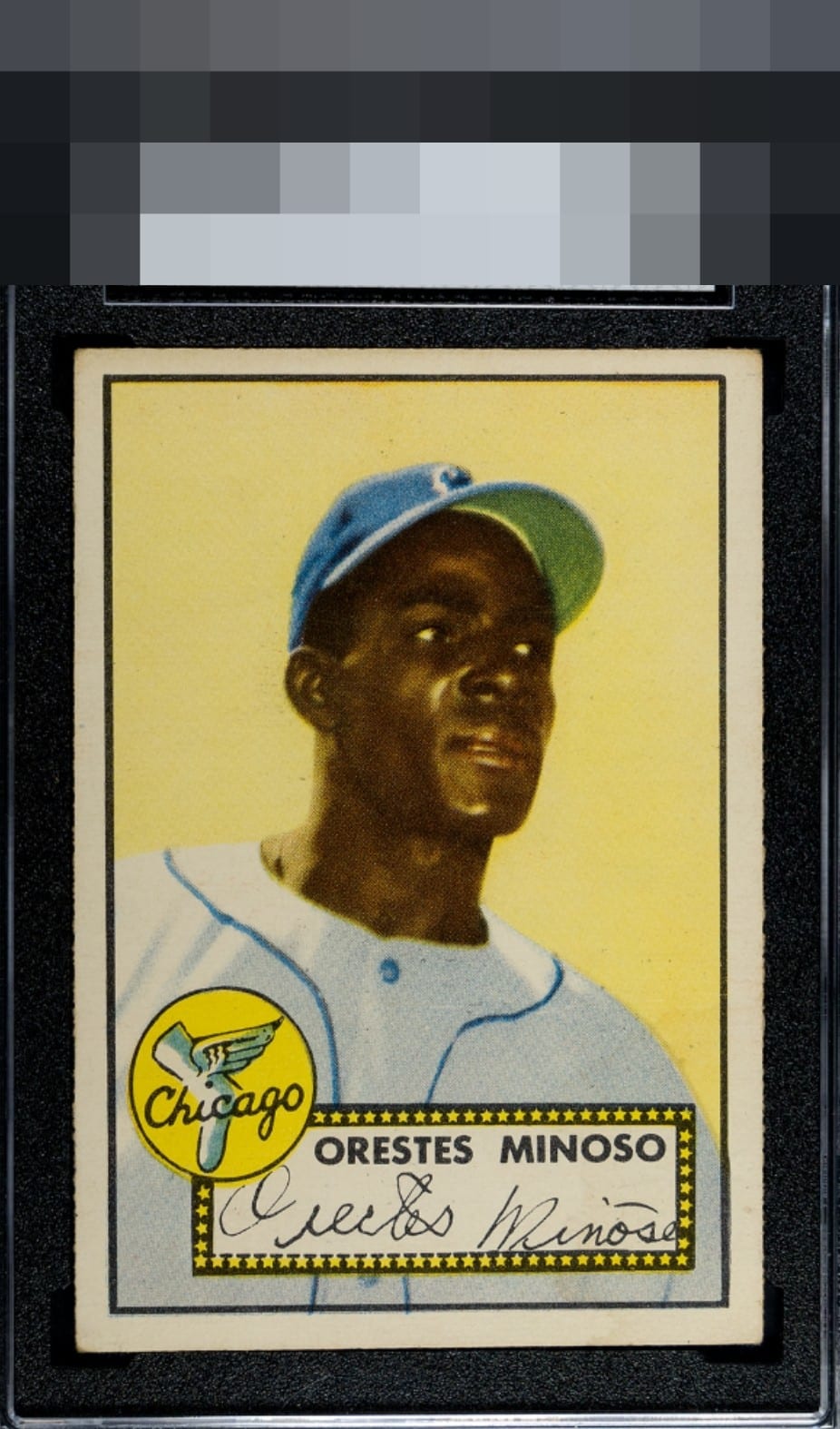
1952 Topps Orestes Minoso #195
1 / 2
Click to enlarge

💬
Reviews & Discussions
9 total reviews

The image and color look good. Centering is off with a tilt though and there's some minor corner wear.

Everything would make the A- tier or higher eye appeal wise except centering. A very solid card.

Textbook nice B+, image, surface, are great. Corners mild wear. Centering is the one flaw that hits the eye.

Centering is all that keeps this from even higher eye appeal badges, as the corner wear is easy on my eye and any other flaws go unnoticed.

Nice card. Centering T/B is biggest opportunity. Colors and image present well but nothing Pops that would bring it to the next level

Very good color and nice image. Yellow background looks free from any blemishes. Pretty good centering.
Locked
2 reviews
EyeQ+
128.0
Global Population
1
POPULATION ACROSS ALL GRADES AND GRADING COMPANIES
Global Eye Rank
#1
Population in Grade
1
POPULATION IN THIS GRADE ACROSS ALL GRADING COMPANIES
Eye Rank in Grade
#1
EYEQ+ TROPHY CASE

1st Place
GLOBAL

1st Place
IN-GRADE
📊
Rating Distribution
9 total reviews
G
0%
A+
0%
A
0%
A-
0%
B+
6 ratings
86%
6
B
1 rating
14%
1
B-
0%
C+
0%
C
0%
C-
0%
D+
0%
D
0%
D-
0%
F
0%
Centering is the only flaw that bumps my eye. Great image and background.