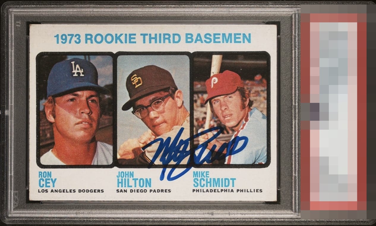
1973 Topps Mike Schmidt #615

Reviews & Discussions
11 total reviews

Perfection, if this was a rarer auto or maybe if the corners were sharper it would be God Tier.

One of just two mainstream issues with mustache-less Mike. Centering is close to spot on, on the front. Couple of soft corners on a 1973 card cap the grade for me.

That auto is so bold it pops off the card. Centering God Tier. Corners prevent God Tier.

The auto is bold and well placed. The card is well centered and the images are clear. Corner wear is the only issues but it wouldn't bother me much.

This auto is perfection and the card has great eye appeal as well. Corner wear that I do notice prevents GT.

The image clarity, especially across all three players’ faces, is the first thing that caught my eye. This example also looks very well centered to me. Finally, the autograph is perfectly placed for my taste.

Beautifully centered, wish Schmidt’s signature was a little over to the right.

Centered, no PD that grab my eye, and the auto is strongly struck. Only corners here and this is the level of corner wear I find ideal; it keeps cost down and in a wall display at a casual distance they look fine.

nice looking card and nice autograph. Great placement of the autograph
EyeQ+
EYEQ+ TROPHY CASE


Rating Distribution
11 total reviews
Nicely framed, solid color & perfect signature placement