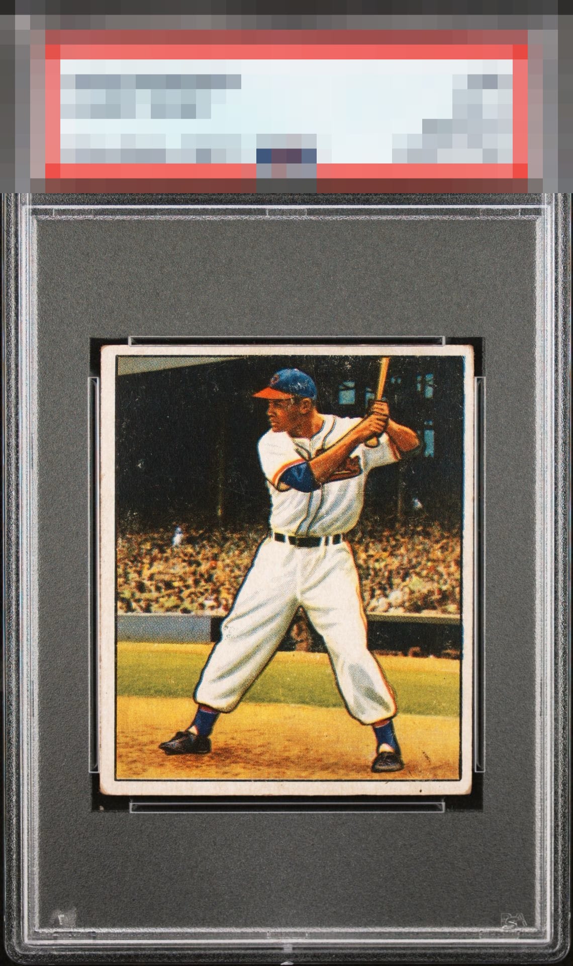
1950 Bowman Larry Doby #39

Reviews & Discussions
11 total reviews

Left to right centering and surface wear on his hat bring down the eye appeal for me


Centering could be better in both directions but overall a nice looking card.

I love signed vintage cards, but am not a fan of those signed on the back personally. That said, I'd still take it over an unsigned version. The auto is bold and the ballpoint is a nice touch. The front has centering and surface issues, but still presents well.

Nothing wrecks the party but the centering could be better and the scuff by his head gets noticed more than it would were the auto on the front. I like the ballpoint auto very much, though.

Centering and surface issues, specifically around his head, hold this one back for me.

Given that the auto was placed on the back, it forces my eye to judge the card's front on its eye appeal as if it were an unsigned piece. That said, the auto on back is fantastic and the ideal style and pen.

To Be Transparent This Card is not for me. Autographs should be on the front where it can be enjoyed with the card and not on the back. The card is off center which is a turn off but the borders are clean and bright and nice sized and the color/image is good The autograph is poorly placed but it is clean and legible. But overall I only "See the card" and not the "Auto"

What a great vintage pen autograph. The card itself is nice for signed vintage. For my eye either better centering or less scuffing by his head would take the eye appeal to the A- level.
EyeQ+
EYEQ+ TROPHY CASE


Rating Distribution
11 total reviews
This card survives my cycloptic scan with its dignity intact. I detect print "static" and a centering shift that create some visual friction, yet not enough to dislodge eye appeal from the B Tier.