1948 Leaf Joe Gordon #117

Reviews & Discussions
10 total reviews

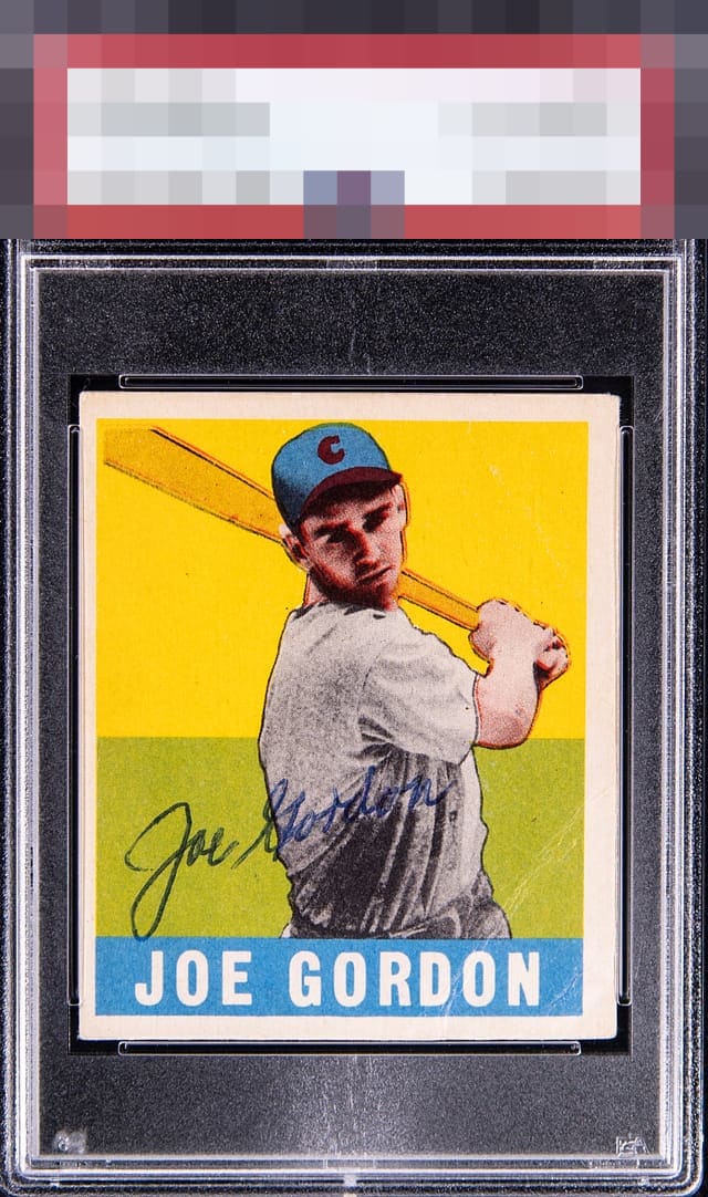
Nice clear auto...I like the ballpoint pen here. The card itself has solid color, offset by centering, registration, and crease on lower right

Beautiful color with a nice ballpoint auto. They’re the the star of the show - but the centering and the creases near the bottom right corner to catch the eye and cap the grade.

Without zooming in this one almost looks like a reprint (in a good way)

I’m into this. I’ve been more lenient on ballpoint autos lately, especially when the image and color are strong.

Solid eye appeal and a great auto + focus. With one of the centering and crease this soars to top tier.

Centering does not impact these signed vintage pieces for me the way it does on unsigned cards. The creasing has minimal impact. The colors, registration, and pen auto win me over.

I see a card that conflicts me. The colors are so crisp and bright and the borders so nice and bold and clean(but centering is an opportunity. I see a nice legible auto this is well placed. But the Autograph is not bold and his last name gets hidden by the uniform and that big crease in bottom right is to noticeable for me.

Card is spectacular as is the autograph. Stunning colors on this one. Centering doesn’t bother me as the main purpose of the card is the autograph.
EyeQ+
EYEQ+ TROPHY CASE


Rating Distribution
10 total reviews
Looks to be an early signature with crisp white borders and centering. The heavy crease seems to blend in somewhat with the bright colors.