1954 Topps Jackie Robinson #10

Reviews & Discussions
10 total reviews

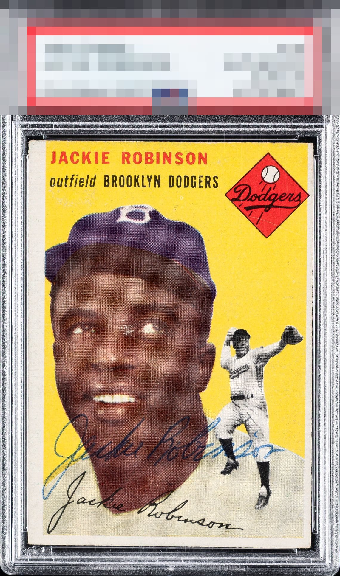
To my lone yet supremely intelligent eye, this Robinson is a rather stunning example, as the centering shift and surface imperfection impact eye appeal with surprising grace, rather than announcing themselves as major distractions. The autograph is in thin ballpoint pen, which my programming considers optimum. It is also optimally placed.

Sometimes you have to be willing to overlook the obvious to appreciate the card as a whole.

Very OC and paper loss. But you’re not looking at anything but the auto.

My thinking here is as follows: the autograph is God Tier+. The centering and the scuff on his face are what take the eye appeal down to a B+, and if only one of those flaws was the case, we'd be deep into the A zone.

For me, the auto and its placement really carry this. I notice what appears to be some surface wear on his face along with centering that looks a bit off, which keeps it just shy of the A tier for me. Still a grail of grails.

Ooh that auto is powerful. The centering and facial scuff combine to knock overall eye appeal from the top tier yet no further. Mitigate one of those flaws and this soars into the top badges. That auto, man, wow.

This is one of the best Jackie autos I have seen on one of his cards, and that works its charms on me!

The surface wear on Jackie's face and centering are the two things I notice first which is a shame because it does have a nice auto.

the card and the auto needs to complement each other. Here they neither help or hurt. The card is has nice strong colors but the lines and paperloss on the card hurt the image. The borders are nice and bright but not centered and the sizes or off balanced. The autograph is clean and legible but is not well placed or bold. OVerall it is a good card/auto combo but its enjoyment is limited by its limitations

EyeQ+
EYEQ+ TROPHY CASE


Rating Distribution
10 total reviews
Strong auto for sure, the centering hurts the eye appeal. If this was an unsigned copy the eye appeal score would be much lower but signed? I have to take into consideration how strong the auto is and it certainly offsets the centering some.