1952 Topps Hank Thompson #3

Reviews & Discussions
16 total reviews


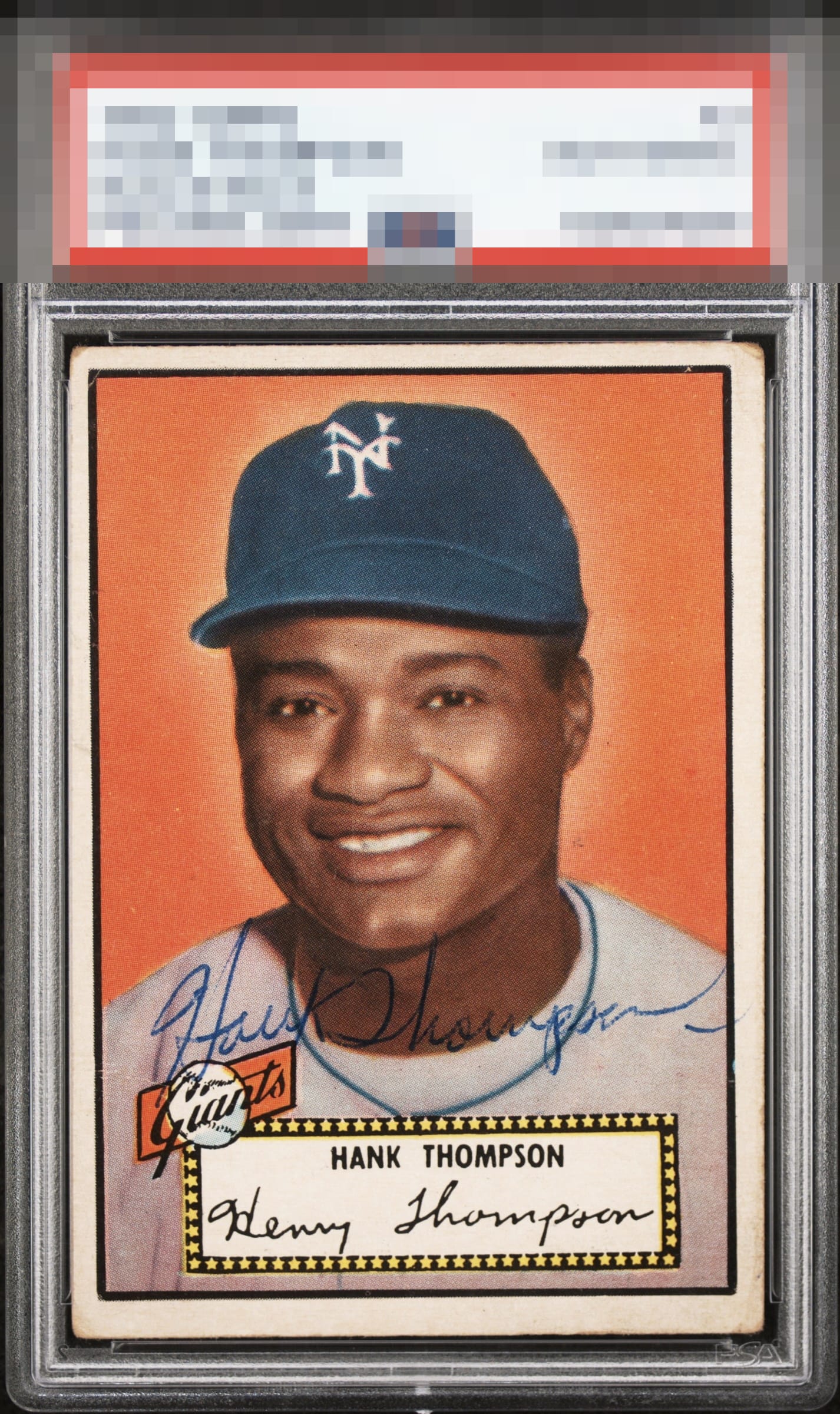
Front of the card is an A! Back of the card is a C. Love the coloring and auto


Just blown away by the colors of this card combined with an electrifying but soft pen sig. Works really well with the stitching of Hank's uniform. If not signed, the card would of course leave you wanting improvement; But we're working with so much more than just the card here

Great looking card, but the off centering is the items that takes it to the C+ for me.

Issues with the corners and edges and centering. Auto and placement look good

Ballpoint vintage auto in a great spot and the tilted/uneven framing is really the only aspect adversely affecting the eye appeal. The central portrait is very clean and bright and that plus the auto holds my eye.

The card really shines but the centering hurts the eye appeal.

Great looking card for an Auth but the tilt does bother me and will always preclude a card from grading above the C band. Color and even wear among the corners are strong.
EyeQ+

EYEQ+ TROPHY CASE


Rating Distribution
16 total reviews
Like the ballpoint pen signature and the card is clean, centering is quite off though which affects the eye appeal.