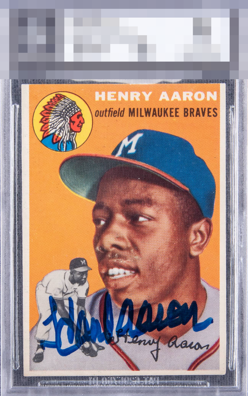
1954 Topps Hank Aaron #128
1 / 2
💬
Reviews & Discussions
6 total reviews

Corners and orange background look really nice. Too much surface wear below the nose. Nice bold auto.


Rather sharp card, off by just a click to the right and down. The auto is among the better sharpie examples from its era. The scuffing on his face is what detracts.

Good placement of auto and a clean auto. The border colors look good the card has corner opportunities overall card presents well
5 reviews
1 review
EyeQ+
--
Global Population
216
POPULATION ACROSS ALL GRADES AND GRADING COMPANIES
Global Eye Rank
—
No Eye Q+ score
Population in Grade
6
POPULATION IN THIS GRADE ACROSS ALL GRADING COMPANIES
Eye Rank in Grade
—
No Eye Q+ score
EYEQ+ TROPHY CASE

GLOBAL

IN-GRADE
Trophies appear here when earned.
📊
Rating Distribution
6 total reviews
G
0%
A+
0%
A
0%
A-
0%
B+
3 ratings
60%
3
B
1 rating
20%
1
B-
0%
C+
1 rating
20%
1
C
0%
C-
0%
D+
0%
D
0%
D-
0%
F
0%
Aside from the surface issues around is face this is a great looking card. Centering is slightly off but the color is great, image is clear, and the signature is bold and well placed.