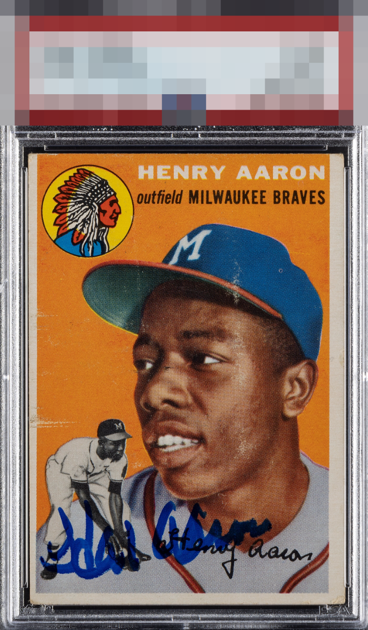
1954 Topps Hank Aaron #128
Reviews & Discussions
11 total reviews


My eye is instantly drawn to the scuffs even before noticing the Centering, the colour is vibrant with a bold autograph that unfortunately bubbled a bit and is in a pretty busy part of the card.

Surface issues around the face and off-centering loses some eye appeal for me.

Love the signature but not the print defects, surface damage, and centering on this one.


Several factors pull the eye's attention here away from simple enjoyment; the scuff in the cap, the horizontal scuff in the left border, and the centering stand out as detracting aspects.


The front of the card has a little too much going on with all the different colors when you add in the blue sharpie

Bold color, nice autograph and placement some speckling but not disctracting and sharp image
EyeQ+
EYEQ+ TROPHY CASE


Rating Distribution
11 total reviews