1954 Topps Hank Aaron #128
1 / 2
💬
Reviews & Discussions
4 total reviews

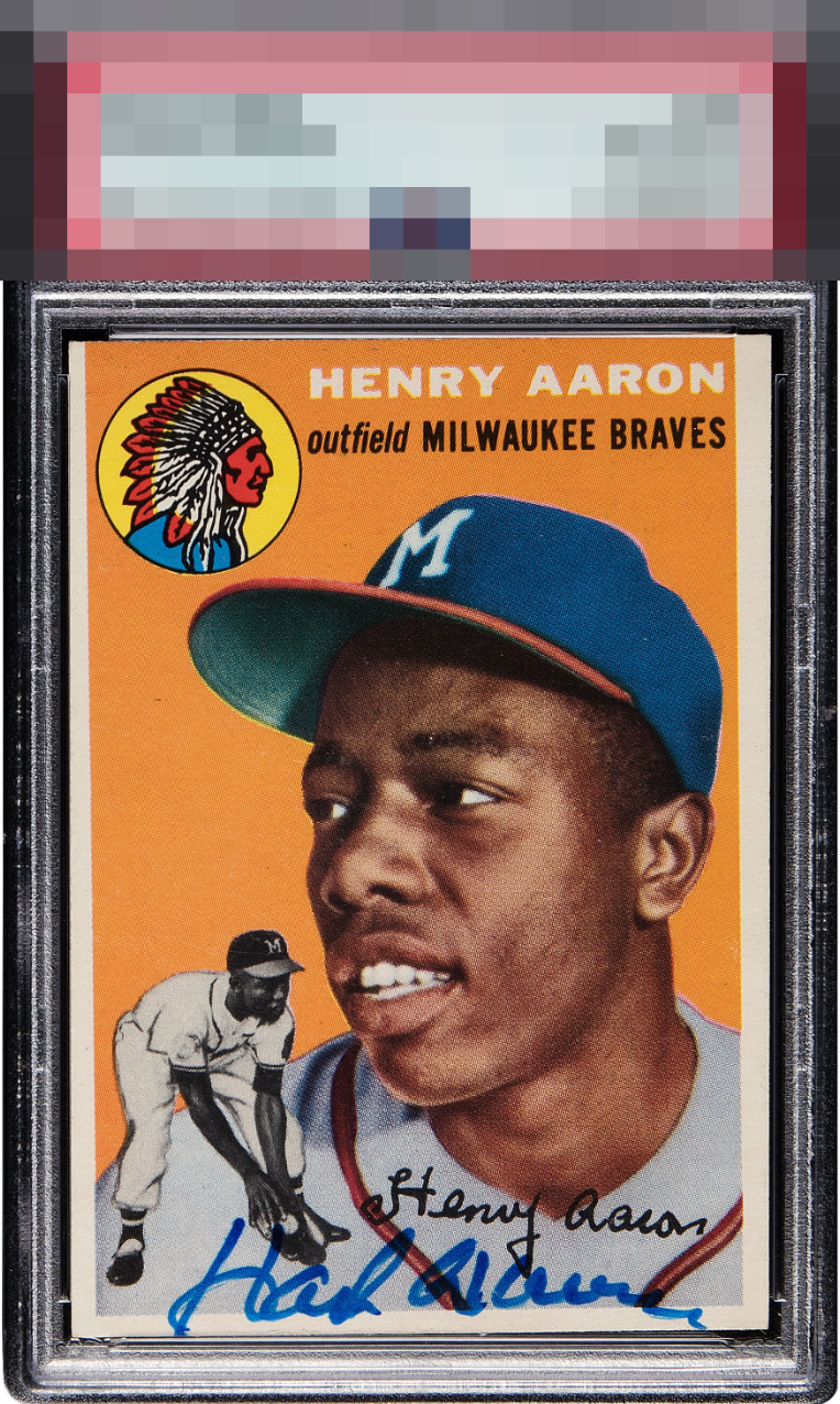
The overall visual impression remains quite strong despite aggressive tilt and mild imperfections in the auto.

Colors really pop. Nice bold auto. Only complaint is the centering and tilt.

Colors really Pop. Autograph is a little low and not as sharp as i would like or seen on other cards. The border is off center. But the Eye Appeal from the Clarity of the card is what stands out
4 reviews

0 reviews
EyeQ+
--
Global Population
216
POPULATION ACROSS ALL GRADES AND GRADING COMPANIES
Global Eye Rank
—
No Eye Q+ score
Population in Grade
6
POPULATION IN THIS GRADE ACROSS ALL GRADING COMPANIES
Eye Rank in Grade
—
No Eye Q+ score
EYEQ+ TROPHY CASE

GLOBAL

IN-GRADE
Trophies appear here when earned.
📊
Rating Distribution
4 total reviews
G
0%
A+
0%
A
0%
A-
0%
B+
3 ratings
75%
3
B
1 rating
25%
1
B-
0%
C+
0%
C
0%
C-
0%
D+
0%
D
0%
D-
0%
F
0%
Very nice color and image on the card. The centering tilt is severe though and stands out. Auto is bold but a little sloppy, especially at the end.