1952 Topps George Crowe #360

Reviews & Discussions
5 total reviews

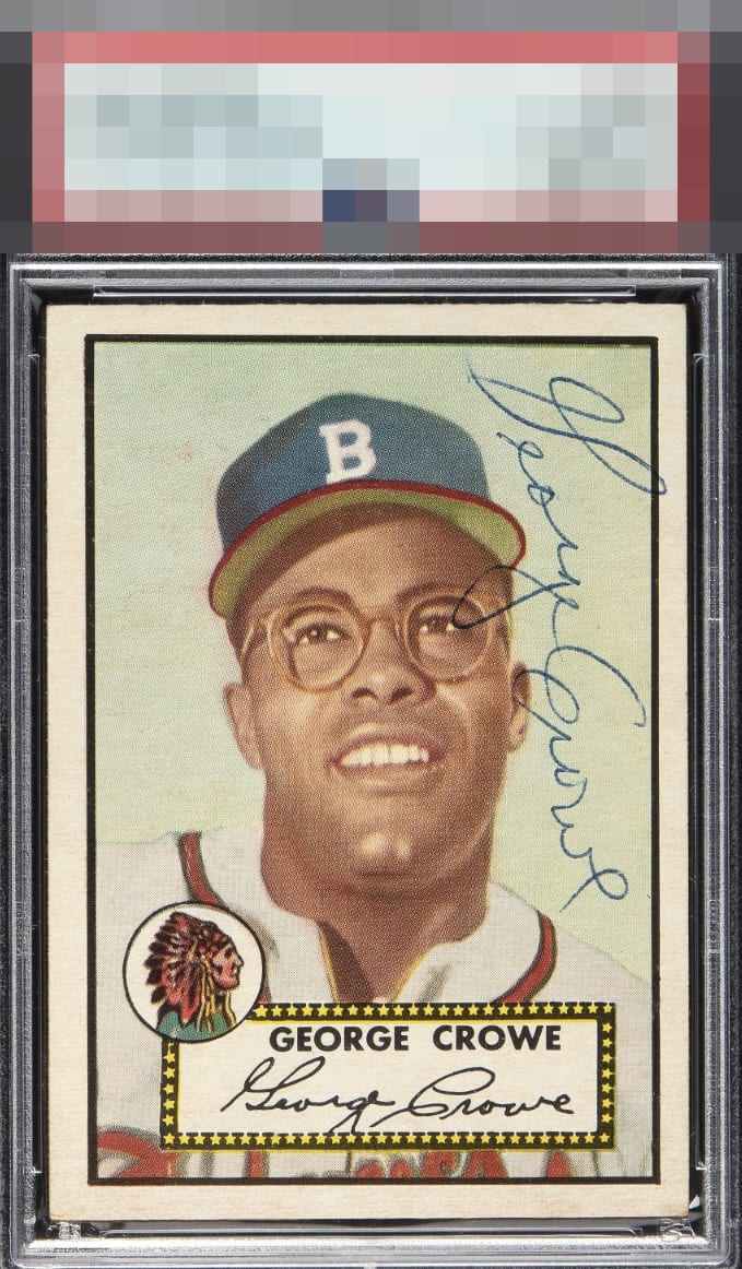
I’m really into the auto placement against the light sky. The color and overall presentation is above average even with the centering opportunity.

I will try to describe it but something about this signed card is just so pleasing to me. The centering is off, but somehow for a centering guy like me it is off in a way that does not bug my eye. The auto placement works for me and love the ballpoint. This is what makes signed vintage so interesting, I suppose. I just dig this one. Now I gotta look up the player!

like the border size but not the centering especially L/R. The card has a nice image and decent colors. The autograph is not in a place I like, it is not bold and does not flow as well as others of his Still they do complement each other and is enjoyable


EyeQ+
EYEQ+ TROPHY CASE


Rating Distribution
5 total reviews
Great signature placement