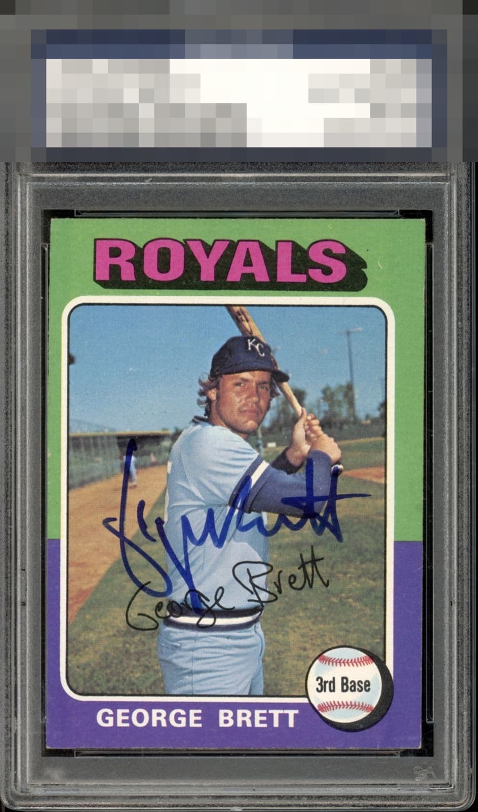
1975 Topps George Brett #228
1 / 2
💬
Reviews & Discussions
3 total reviews

Image looks good but colors don't pop. Centering is the obvious issue. Beautiful auto.

What makes signed vintage so tough when it comes to eye appeal is the added dimension of the auto and the interplay between auto, all its variables (ink strength, placement) and the card, and all its variables. Here the auto is rather nice and well placed. The centering just puts a hard ceiling on the eye appeal, for me.
3 reviews

0 reviews
EyeQ+
--
Not eligible for AUTH cards
Global Population
5
POPULATION ACROSS ALL GRADES AND GRADING COMPANIES
Global Eye Rank
—
Not eligible for AUTH cards
Population in Grade
2
POPULATION IN THIS GRADE ACROSS ALL GRADING COMPANIES
Eye Rank in Grade
—
Not eligible for AUTH cards
EYEQ+ TROPHY CASE

GLOBAL

IN-GRADE
EyeQ+ scores are not available for AUTH cards.
📊
Rating Distribution
3 total reviews
G
0%
A+
0%
A
0%
A-
0%
B+
0%
B
1 rating
33%
1
B-
0%
C+
1 rating
33%
1
C
1 rating
33%
1
C-
0%
D+
0%
D
0%
D-
0%
F
0%
The card and the autograph need to work together to enhance the overall enjoyability of a card. Often one enhances the other. In this case neither helps the other. The card has a center shift and surface wear. The autograph is not one of his cleanest or most legible and it is poorly place. It is bold. Basically if you are a fan of George or an autograph fan than it is a good starting point/place holder card. For me I would respectfully pass