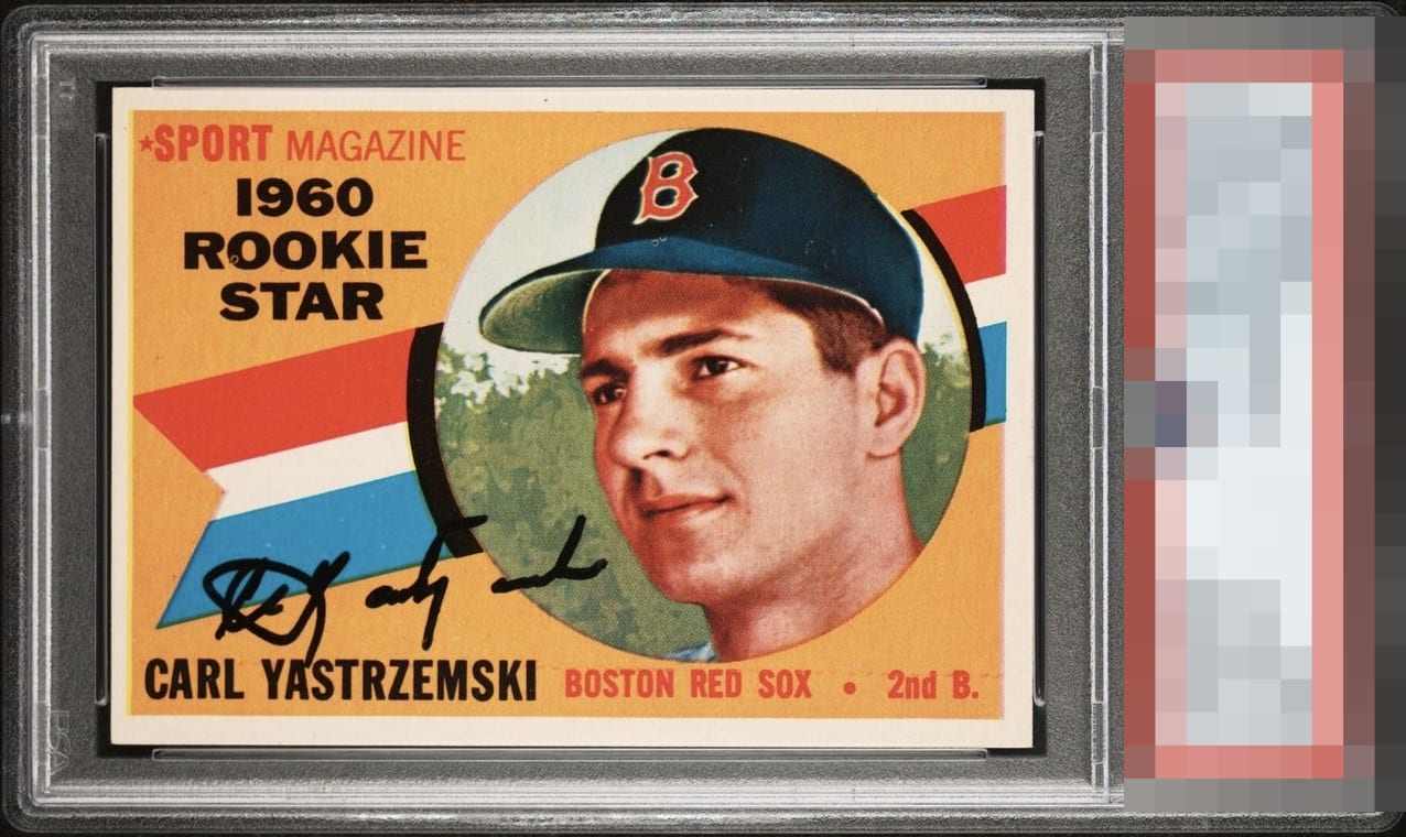
1960 Topps Carl Yastrzemski #148

Reviews & Discussions
12 total reviews

Great looking card and the signature is bold and well placed. Slight centering shift and a couple small print defects bring the grade down a little.

Very strong eye appeal. Side centering, some minor print flaws, but the overall impression is pleasing.


When considering signed vintage, I put a lot into the autograph and centering. Carl's signature leaves me wanting more here. Centering isn't too far off, but somewhat noticeable. Corners incredibly sharp, color is superb. A lot to consider here!

Really nice, just a little off-center . Amazing colors and corners.


A+ Color A- Registration / Surface A Cut / Centering Near perfect card. Excellent auto. Only minor defect I can see from 18” away is the yellow color plate was applied by Topps slightly to our left which impacted centering (actual centering is close to 50-50).

The only thing holding this card down is the centering is off left to right. Otherwise this is a Magnificent card. Love the corners, the colors and the image. The autograph is place perfectly and is clean and bold and legible

Love the card. Love the auto placement and choice of color. Stunning example of the Yaz
EyeQ+
EYEQ+ TROPHY CASE


Rating Distribution
12 total reviews
Great looking card. Centering is all that I can highlight here that lowers the eye appeal.