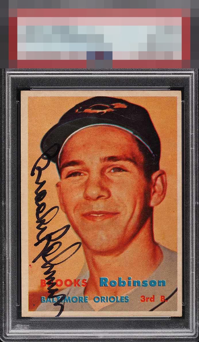
1957 Topps Brooks Robinson #328
1 / 2

💬
Reviews & Discussions
5 total reviews

Like the look of this piece and the auto really pops. Key that the face is focused, also. Centering the lone issue.

I like the card more than the autograph. The autograph is oddly placed and is a nice autograph but a visual distraction to me. The image and the colors of the card are strong. The centering is off but it has nice borders and the aging of the borders is even to making look like it belongs that way
3 reviews
2 reviews
EyeQ+
--
Global Population
1
POPULATION ACROSS ALL GRADES AND GRADING COMPANIES
Global Eye Rank
—
No Eye Q+ score
Population in Grade
1
POPULATION IN THIS GRADE ACROSS ALL GRADING COMPANIES
Eye Rank in Grade
—
No Eye Q+ score
EYEQ+ TROPHY CASE

GLOBAL

IN-GRADE
Trophies appear here when earned.
📊
Rating Distribution
5 total reviews
G
0%
A+
0%
A
1 rating
33%
1
A-
1 rating
33%
1
B+
1 rating
33%
1
B
0%
B-
0%
C+
0%
C
0%
C-
0%
D+
0%
D
0%
D-
0%
F
0%
Great signature placement.