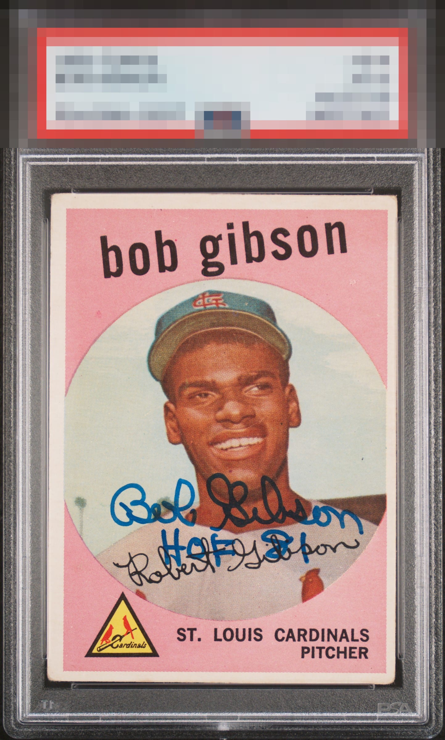
1959 Topps Bob Gibson #514
Reviews & Discussions
9 total reviews

Yes, the centering is off and the inscription goes over the facsimile autograph. But... I like that focused image and the main auto pops beautifully.

Without the signature it’s second tier but that nicely placed auto bumps it up a notch

Auto is the star here and it's bold and well placed; I could do without the inscription yet that's a non-issue. Centering and corners make less impact in the presence of the auto, so eye appeal for the piece remains high overall.

Clean card with a great auto. Centering is a little off with a tilt and there is corner wear, but they don't bother me as much when the auto is this nice.

Love the auto and like the card. The card is clean and bright with centering as the main opportunities. The autograph is a good auto but not his best and it is in a good location

EyeQ+
EYEQ+ TROPHY CASE
Rating Distribution
9 total reviews
Very nice. I wish he didn't sign on his face, but there wasn't a lot of room...