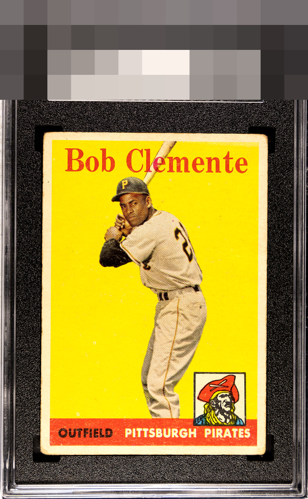
1958 Topps Bob Clemente #52
Reviews & Discussions
13 total reviews

I am really amazed I like this one so much even with such corner rounding! The clean yellow plus the centering are clearly what I am responding to so well.

Corners are touched kind of hard and orange area has some speckling but the eye appeal recovers nicely as a result of centering. Nice card.

Centering is extremely good. The surface wear and corners keep this from the top of the mountain.

nice eye appeal with strong image and colors. Border wear around corners holds it back

Very well-centered and love the image. Surface wear is noticeable on the bottom red banner.

Very good overall appeal. This card has wear in just the way that disturbs my eye the least. Centering is A+ and the image and yellow background are also top tier. Corner wear the salient flaw and is all that prevents the highest row of badges. The numerical system likely sees this as a 2-3, which would be a failing grade; my eye sees much stronger appeal than that.
EyeQ+
EYEQ+ TROPHY CASE
Rating Distribution
13 total reviews
This one really punches above its weight class! Very good eye appeal.