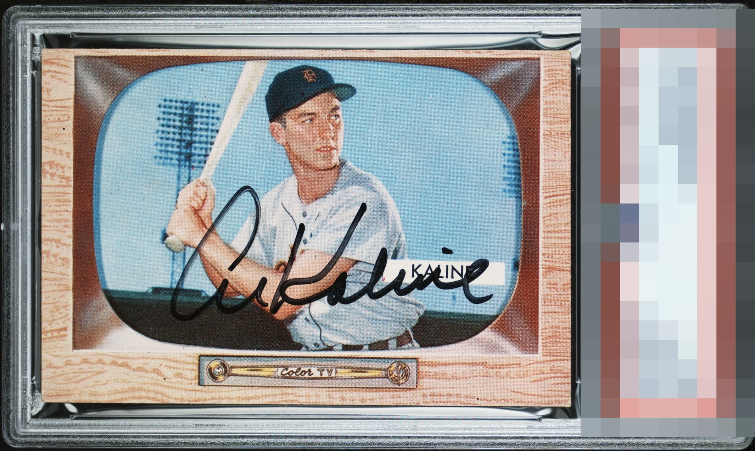
1955 Bowman Al Kaline #23

Reviews & Discussions
7 total reviews

Great overall vibe and presentation here. Centering is just a touch high, and the streak in the A holds it back from GT for me, but I’m grasping at straws.

If that opening A had more ink flow this is God Tier. I love the overall look of this piece. It has that it factor or mojo a signed card needs.

It's all about the total impression with these signed vintage cards. I see the streaking in the A and I see the high centering but the overall impression and reaction is WOW to me and so that is what overrides the individual flaws. They just don't bother me or dampen the WOW.

Very good colors and image. Centering is a bit high. Auto is nice but I notice a few light spots in the "Al".

this is a nice looking cad and the borders frame the card well. The paneling is relatively clean the image is card but the vertical crease in the card near his face and the black spots holds it back The autograph is well place and clean and legible.
EyeQ+
EYEQ+ TROPHY CASE


Rating Distribution
7 total reviews
Signature works well on the card, which looks pretty fresh